The Flying Pickle
Brand Creative Management
The Goal
To rebrand, refresh, and maintain the brand and visual identity for The Flying Pickle through social media, marketing and advertising, environmental design, apparel, and web.

Starting Fresh
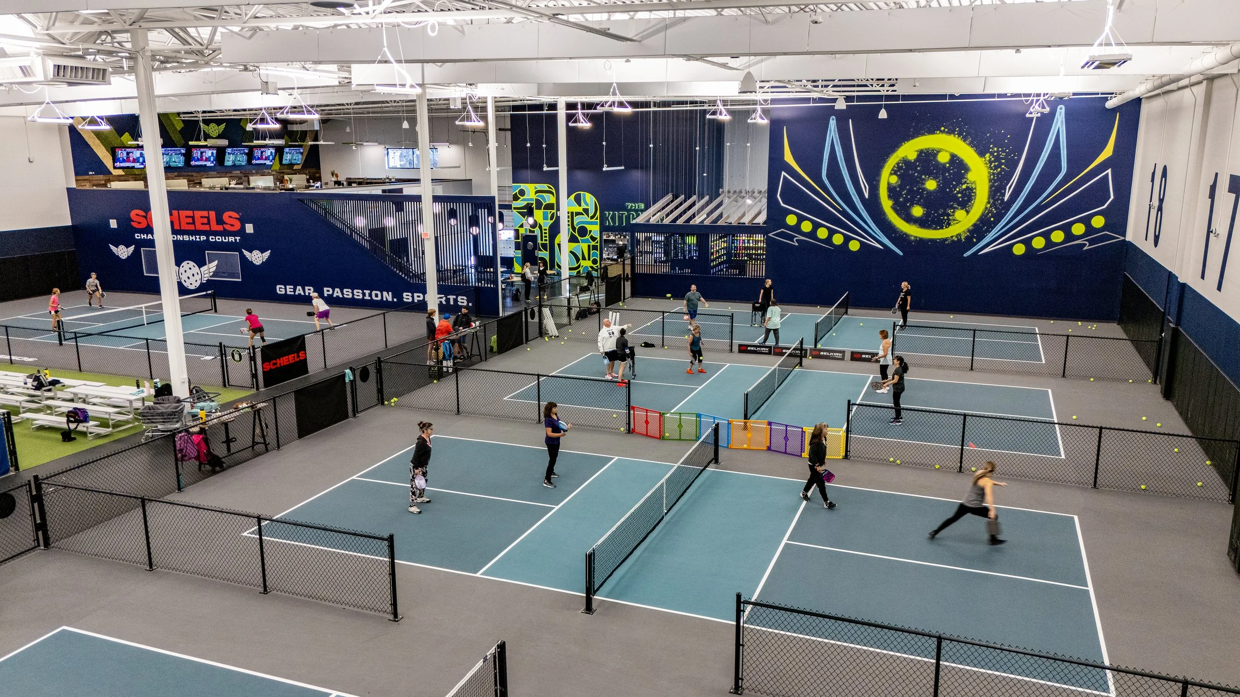
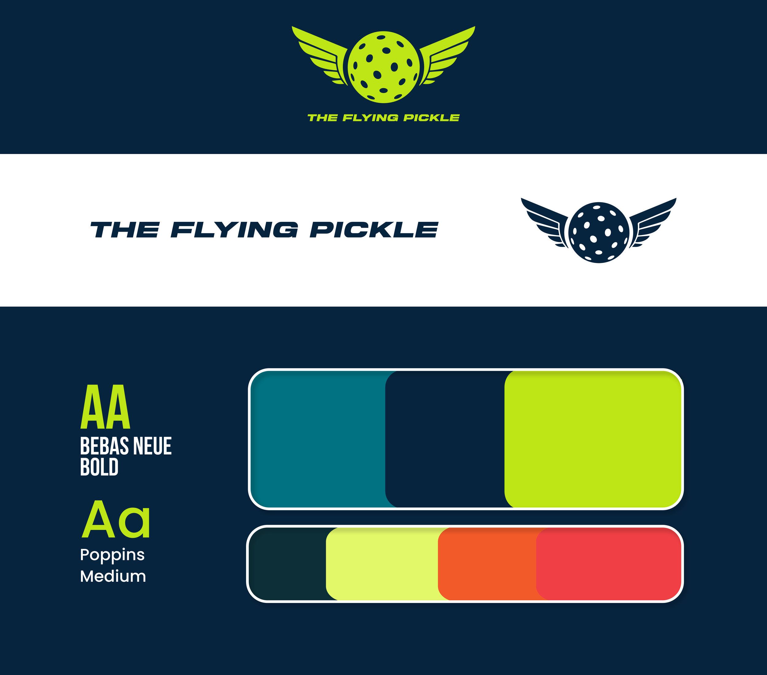
As Brand Creative Manager, I rebuilt and now maintain The Flying Pickle’s visual identity across social, events, digital advertising, apparel, packaging, and in-club experiences. This page shows how a single brand system stays cohesive across hundreds of fast-moving touchpoints.
When I joined The Flying Pickle, the logo was the only consistent brand element in place. I rebuilt the entire visual system around it — establishing clear rules for color, typography, layout, photography, iconography, events, apparel, and digital content so the brand could function as one cohesive identity across every platform.
The full brand guidelines now serve as a foundation for everything TFP produces, making it possible to scale into new markets while keeping visuals consistent and recognizable. What’s shown here is a glimpse into that system and how it’s applied across real-world assets as the brand continues to grow nationwide.
What I Did
Brand System Guidelines
Multi-Platform Creative Direction
Social & News Graphics
Digital Advertising Assets
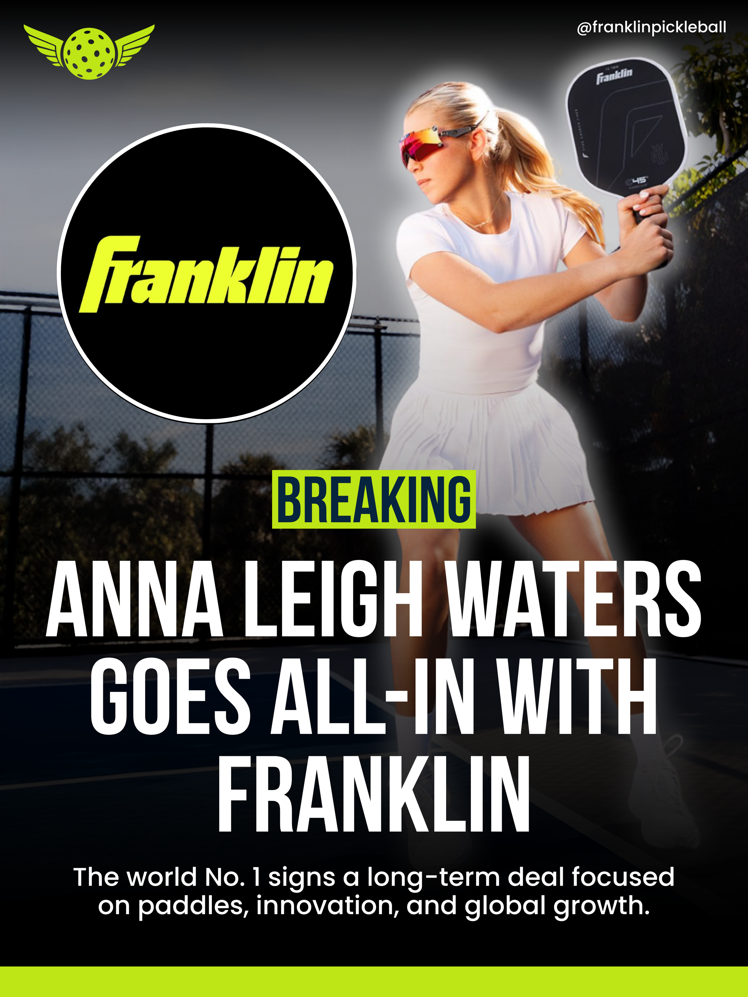
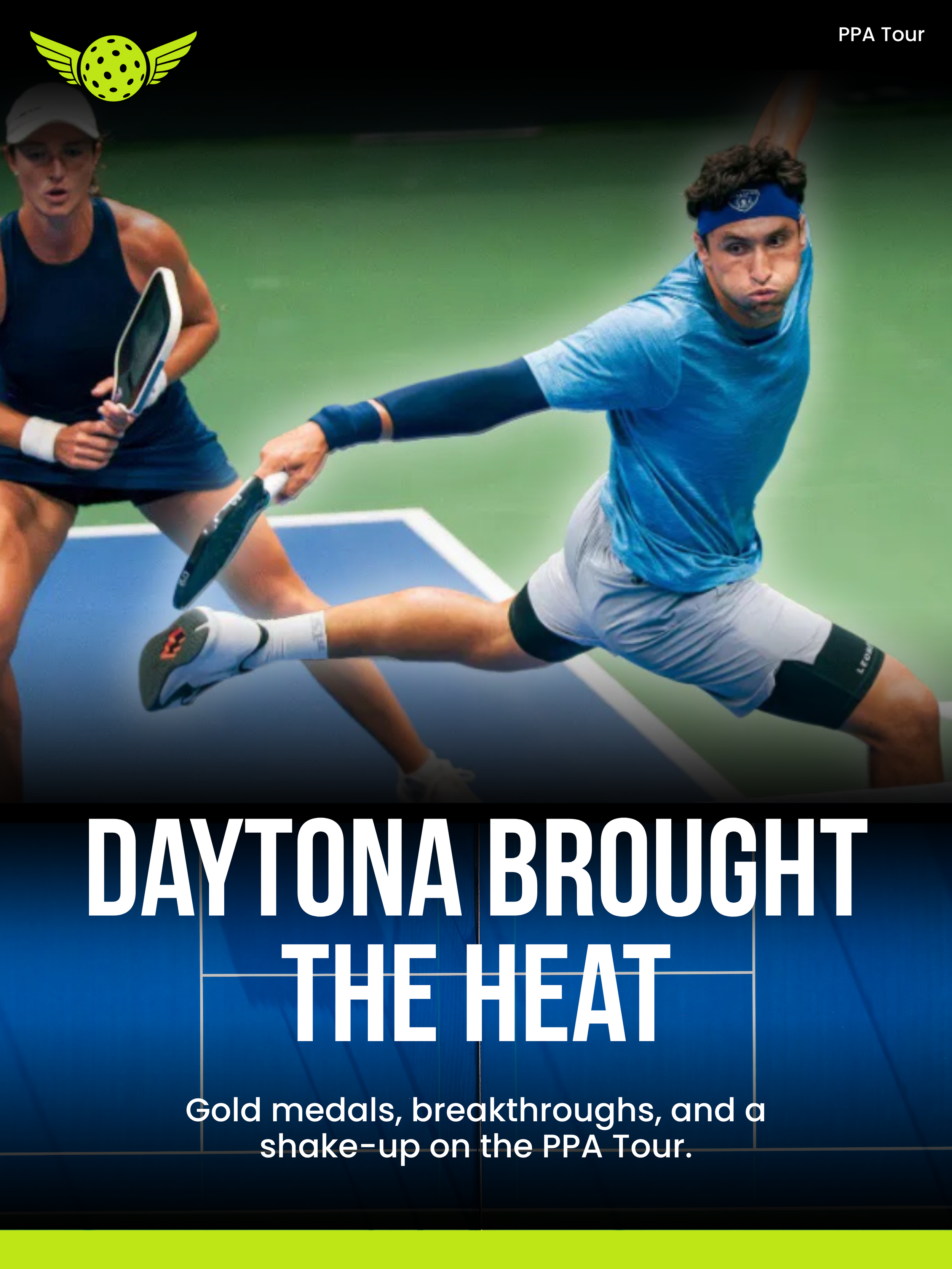
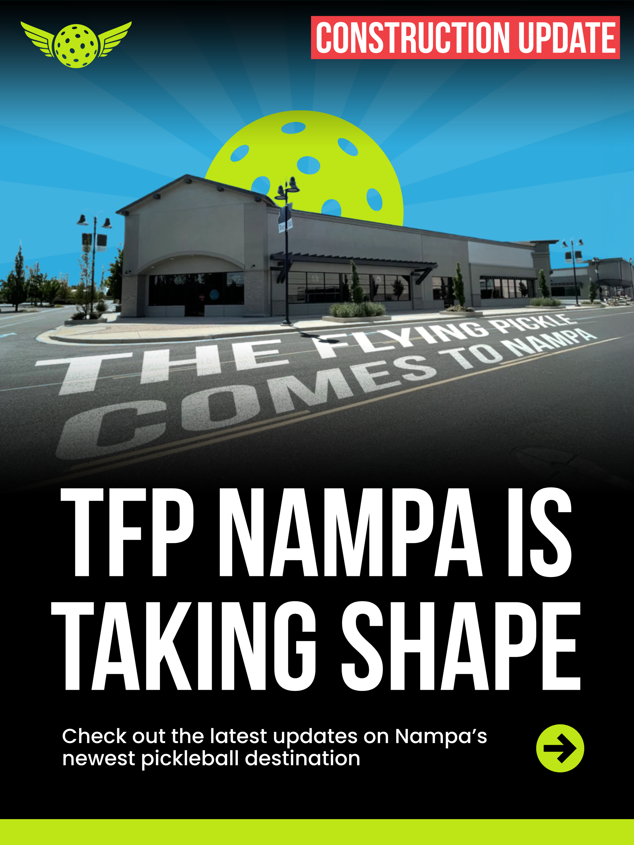
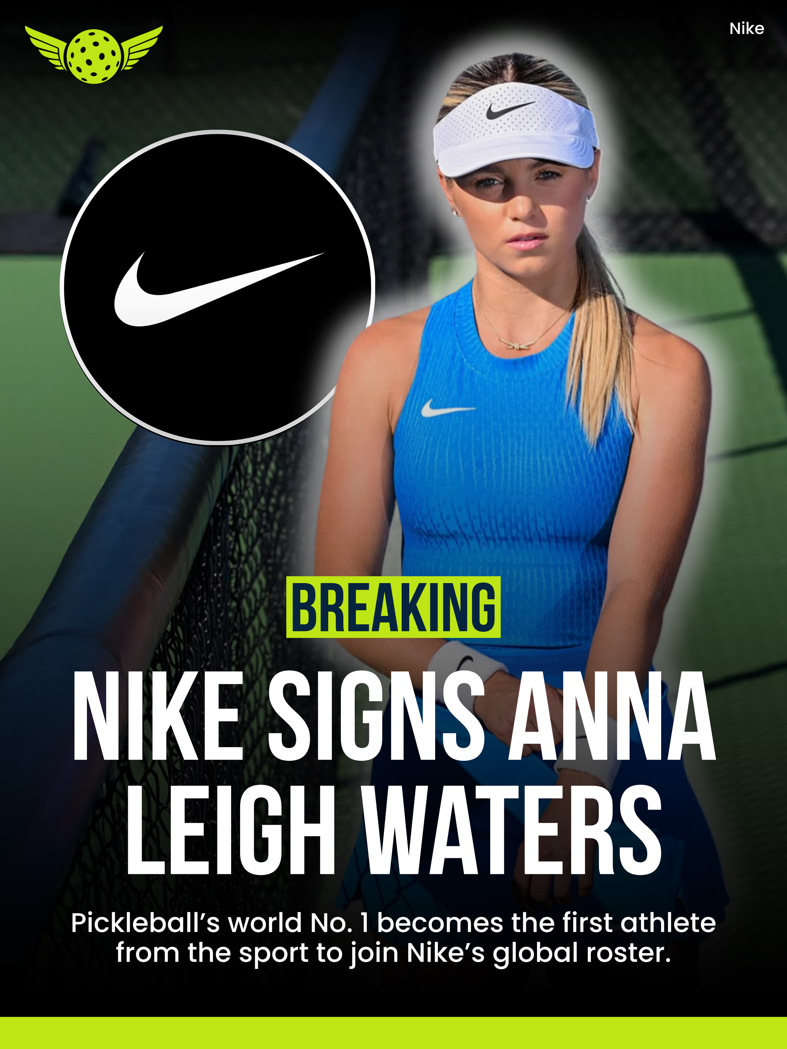
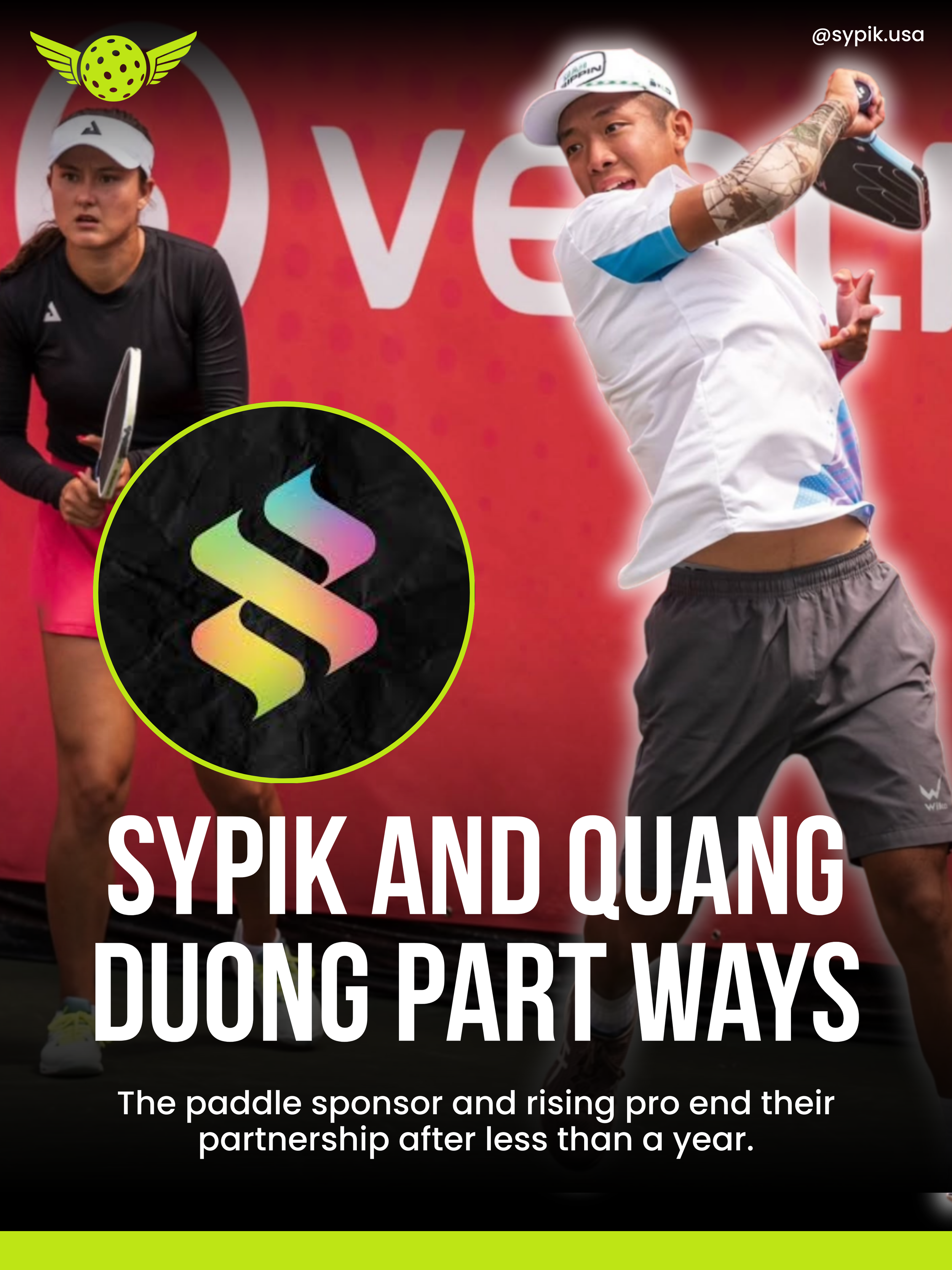
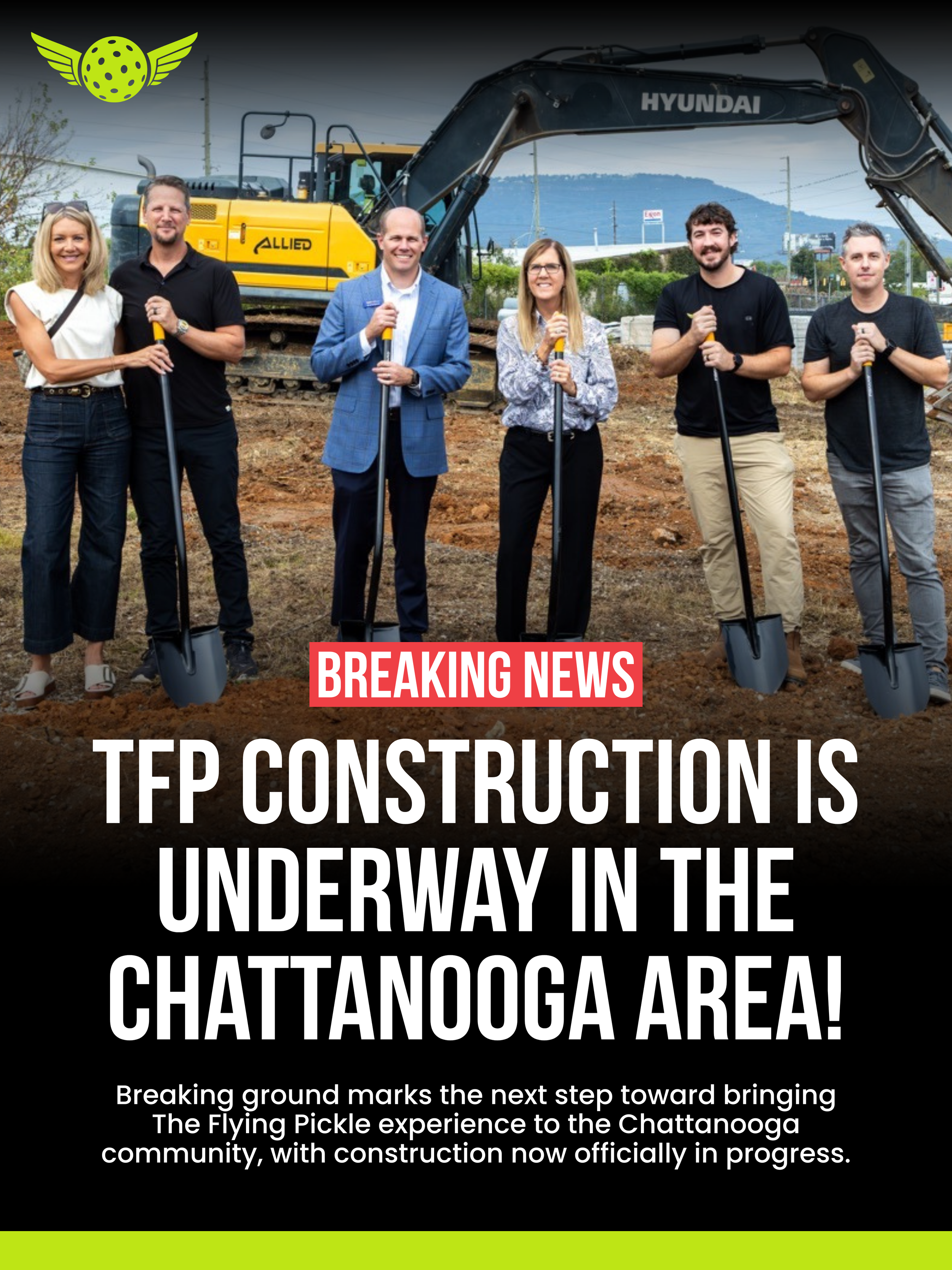
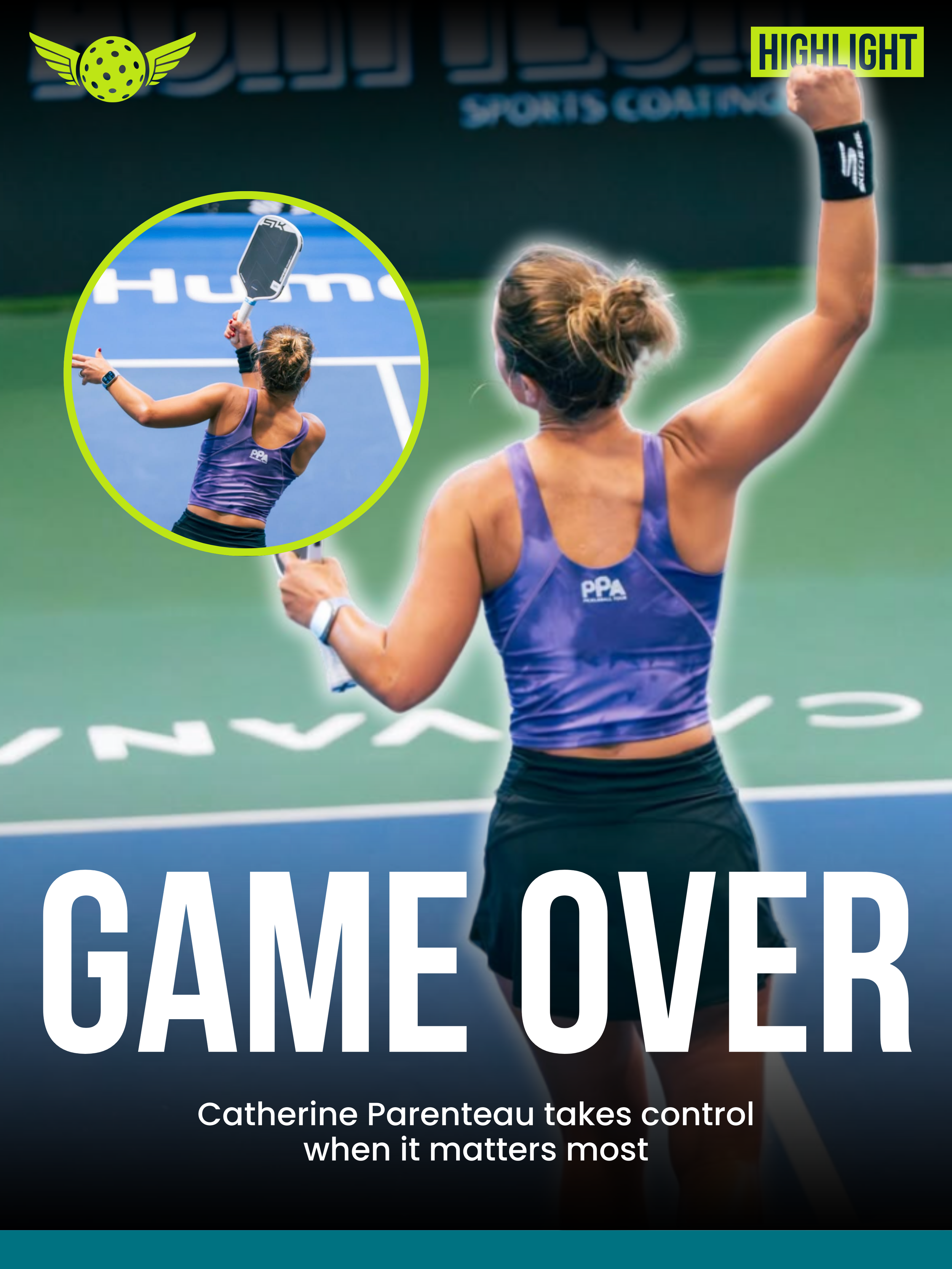
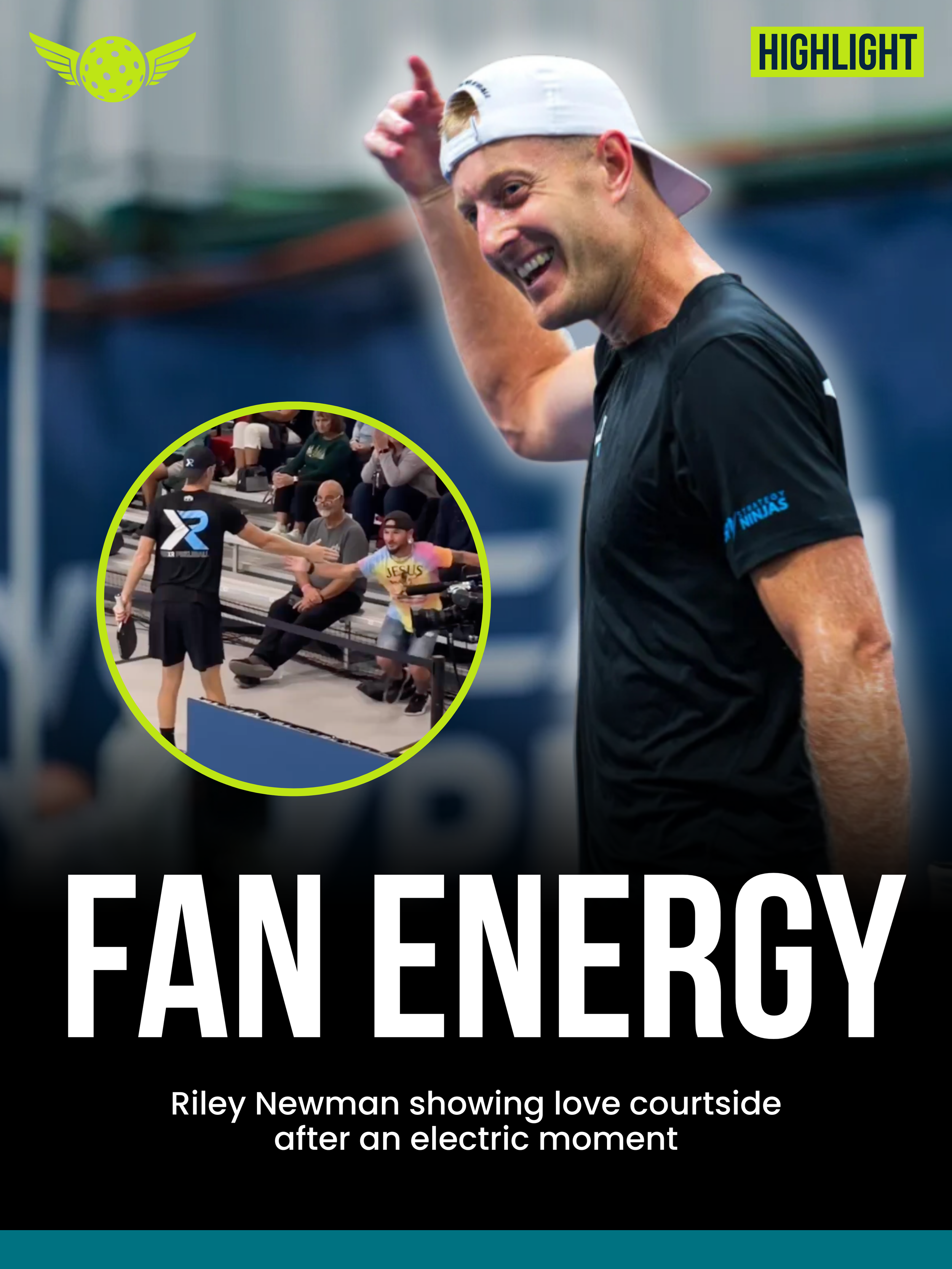
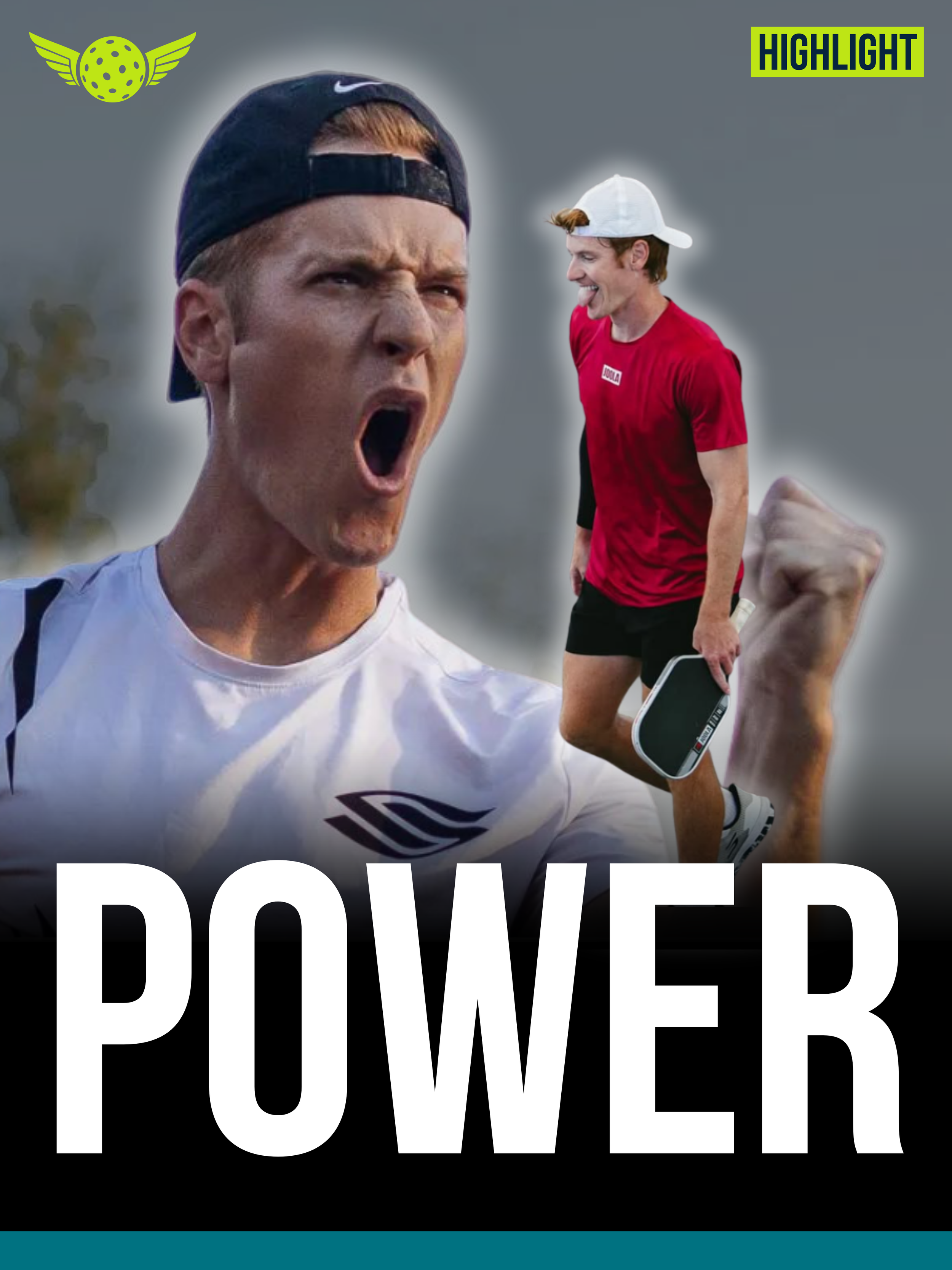
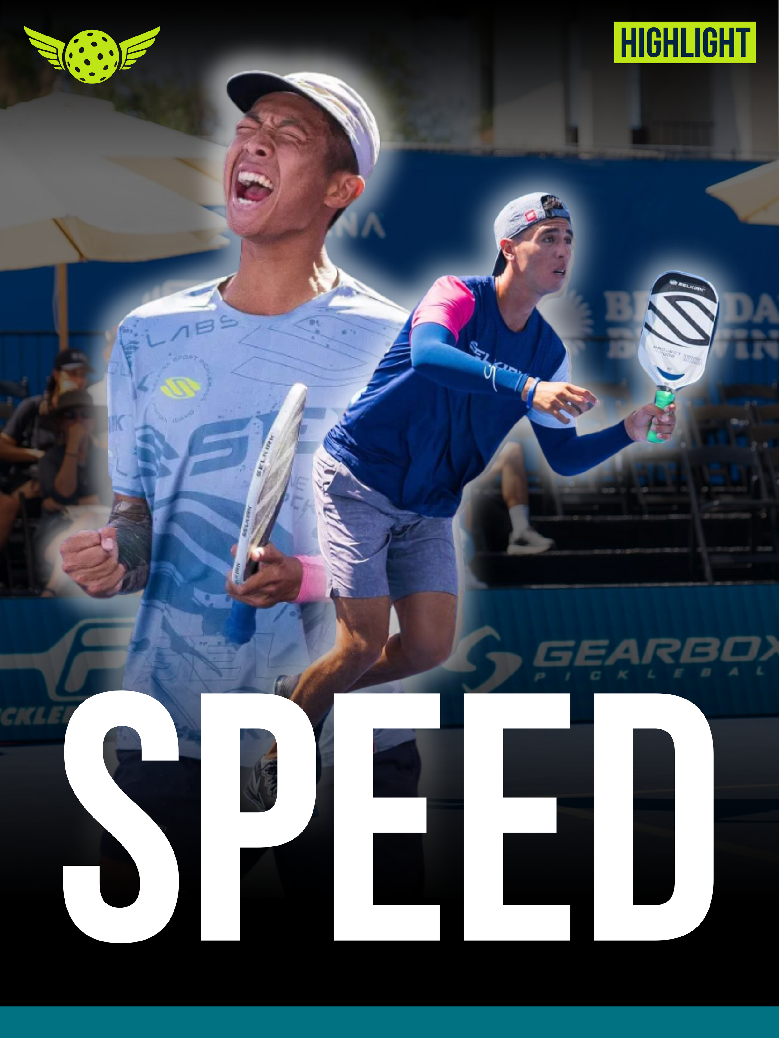
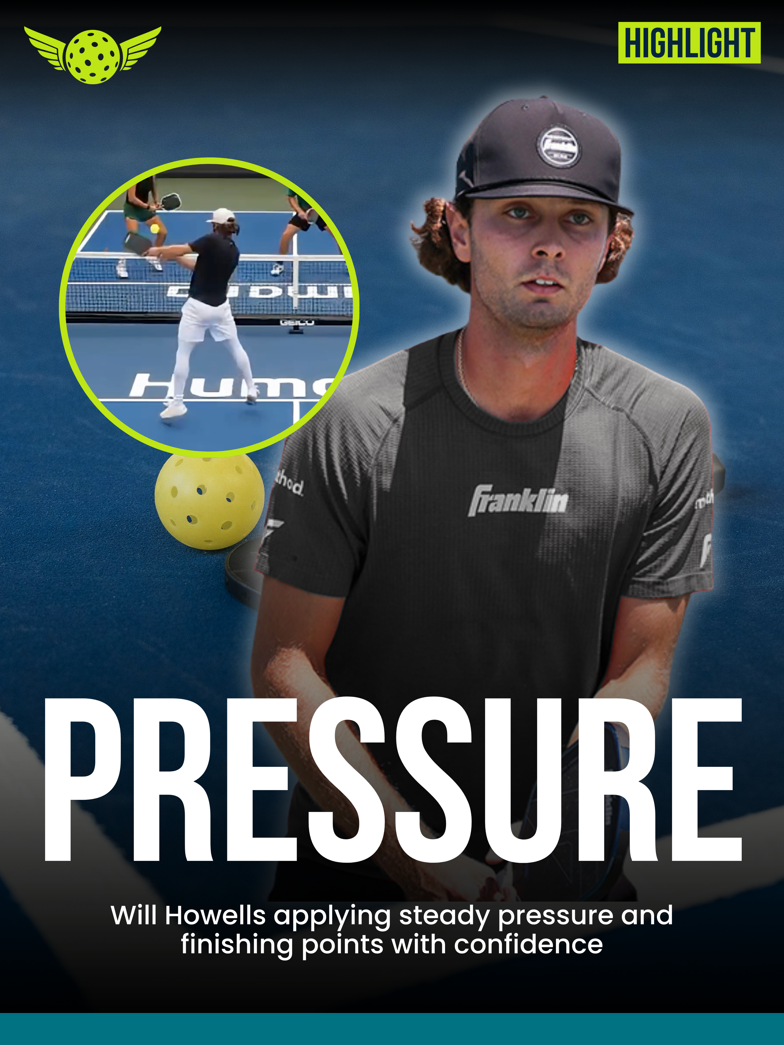
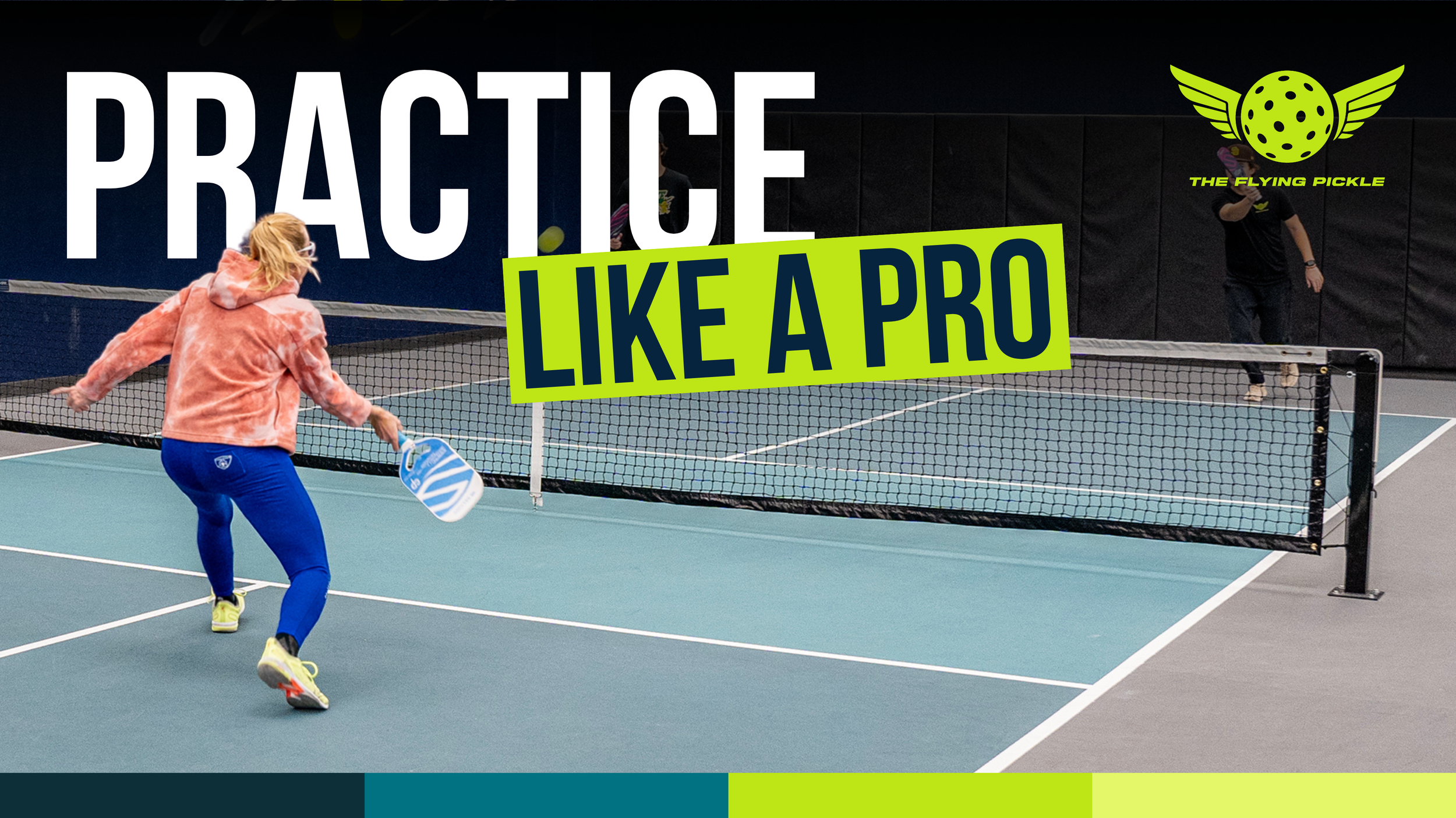
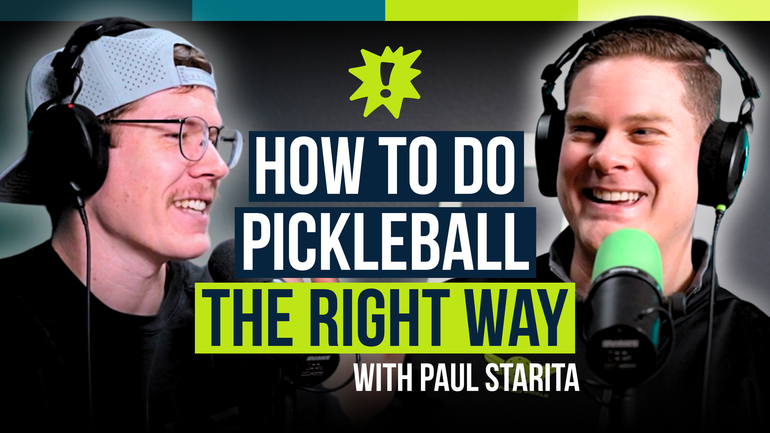
Corporate Social: News & Highlights
TFP publishes daily pickleball news, match highlights, and breaking updates. These posts are designed and delivered quickly while still adhering to strict brand standards, ensuring the club looks polished and credible even when reporting in real time.
Real-Time Sports Media
News Carousel Covers
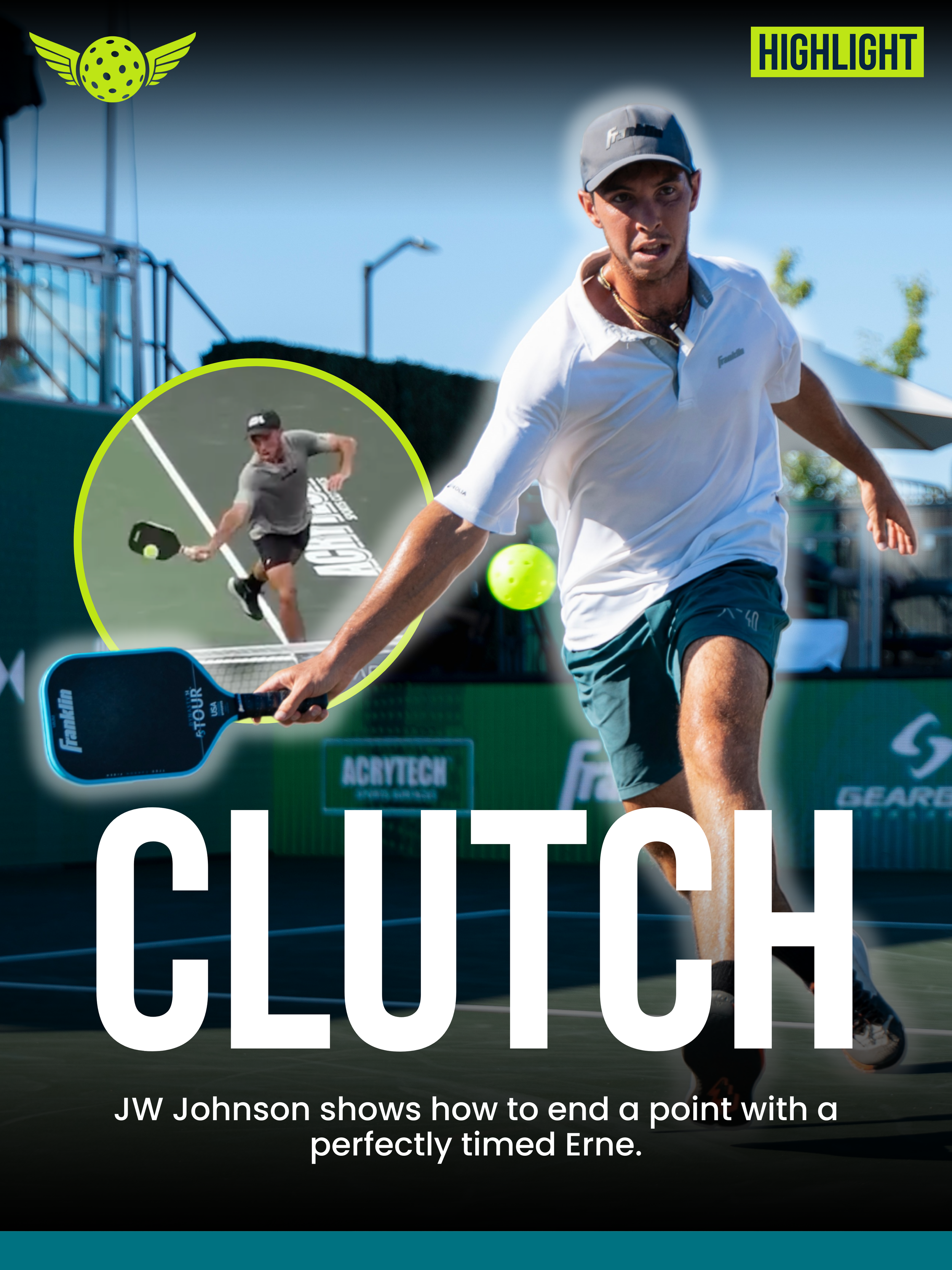
Highlight Reel Covers
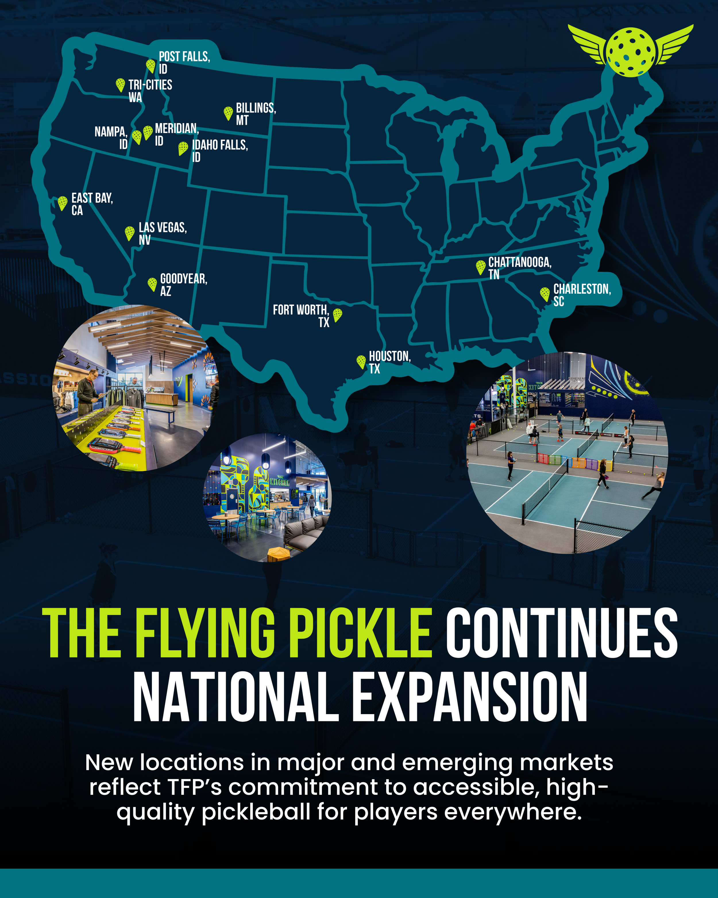
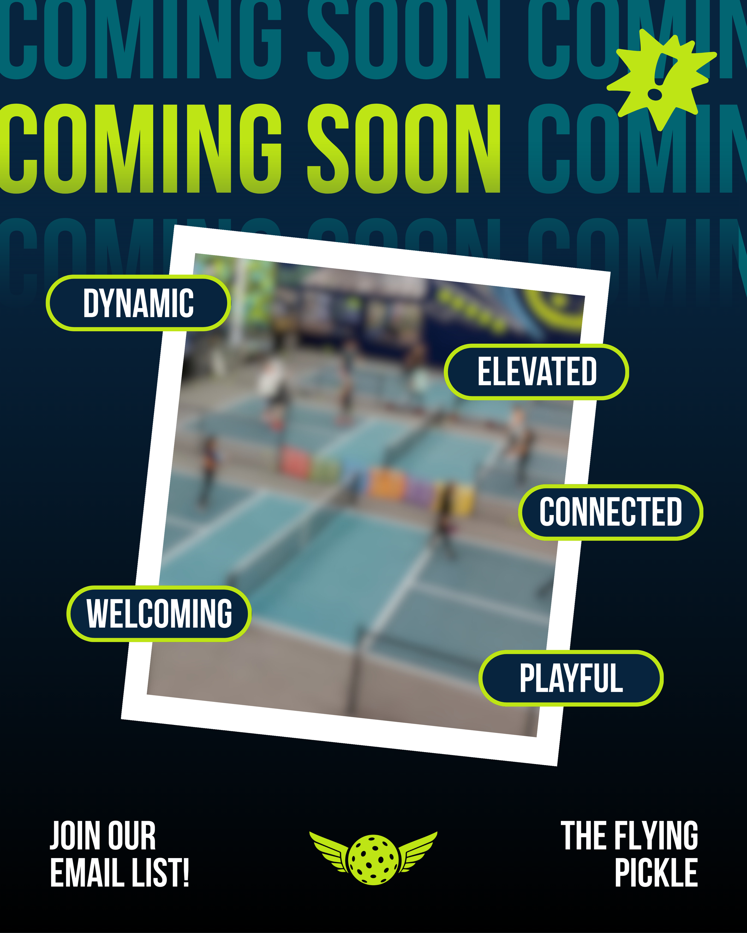
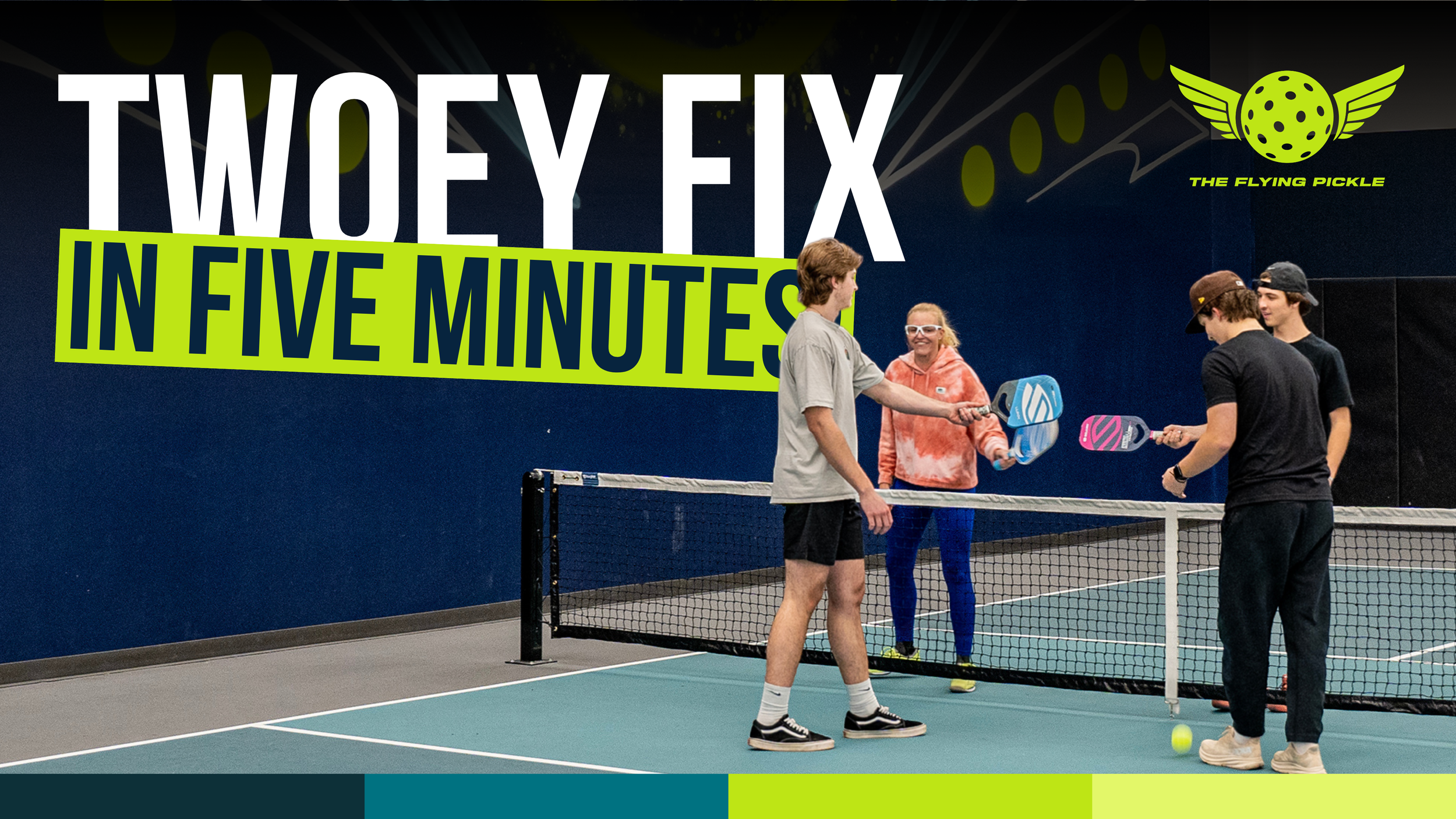
General Social: Franchise Marketing
Club-Level Brand Execution
These assets support individual club locations, promotions, and community engagement. Each post is tailored to local audiences while staying visually aligned with the larger TFP brand.
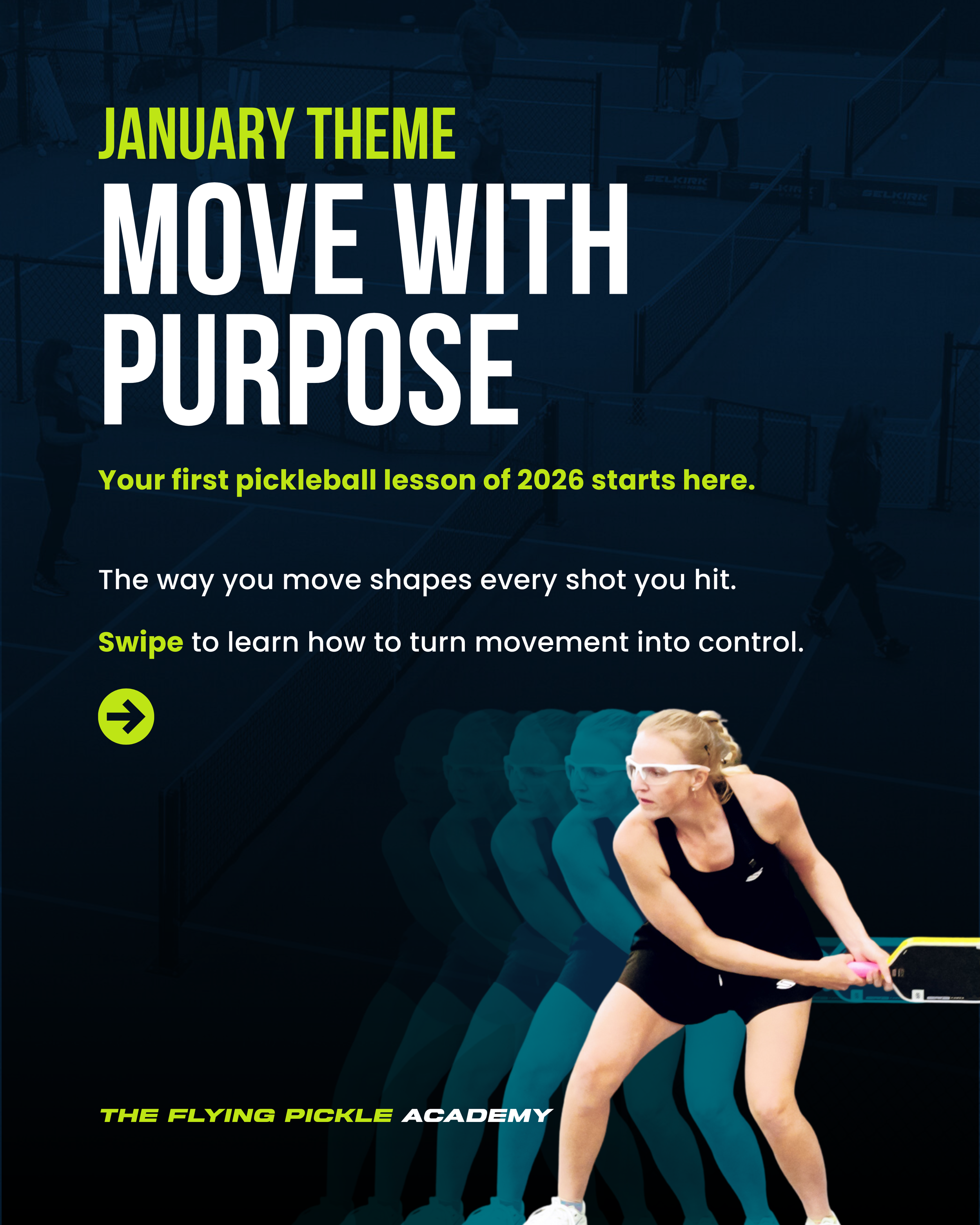
News Carousel Covers
YouTube Thumbnails
Club-Level Brand Execution
TFP’s visual identity extends beyond social into video and long-form content. Thumbnails are designed to be eye-catching and clickable while staying consistent with the brand’s color, typography, and tone.
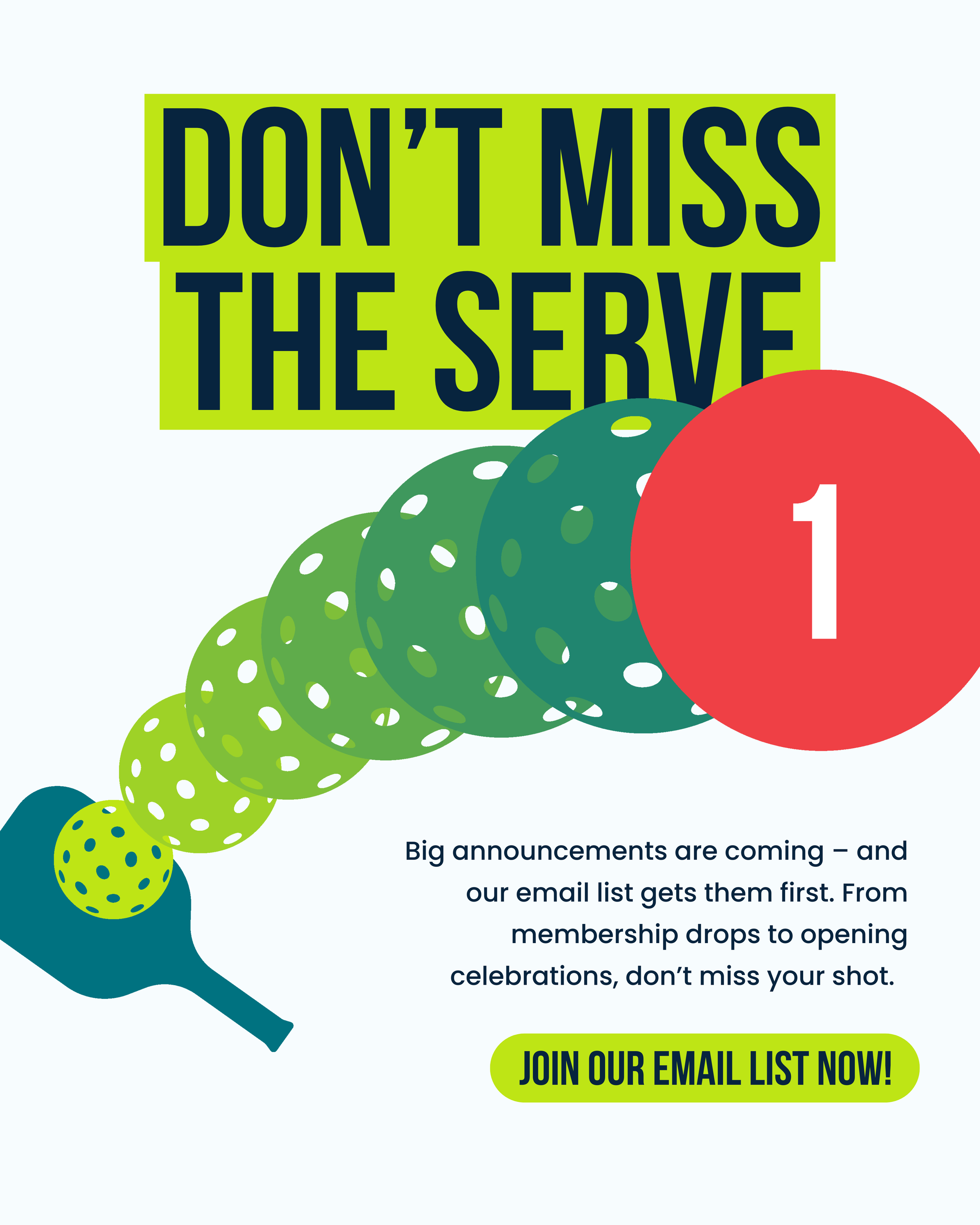
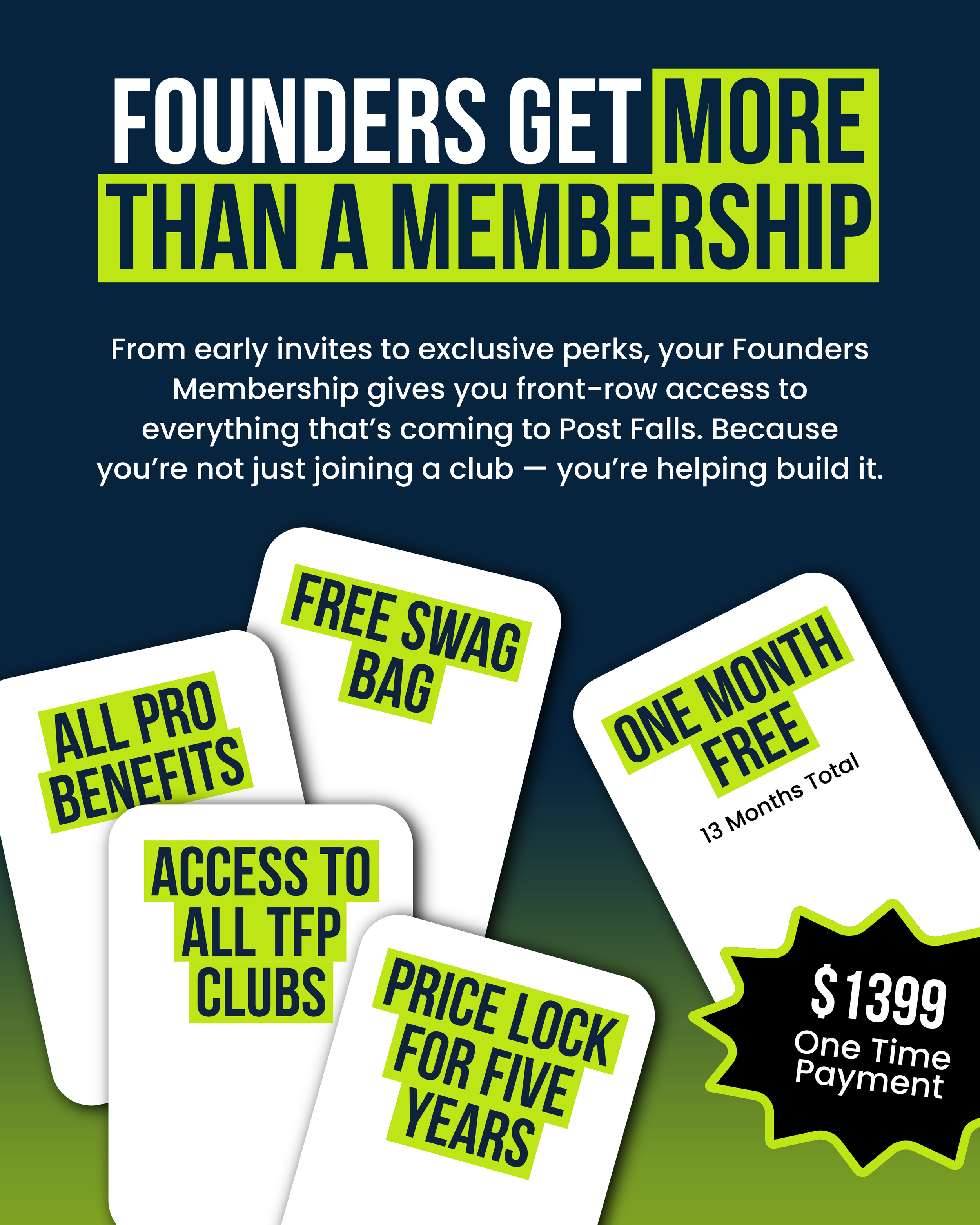
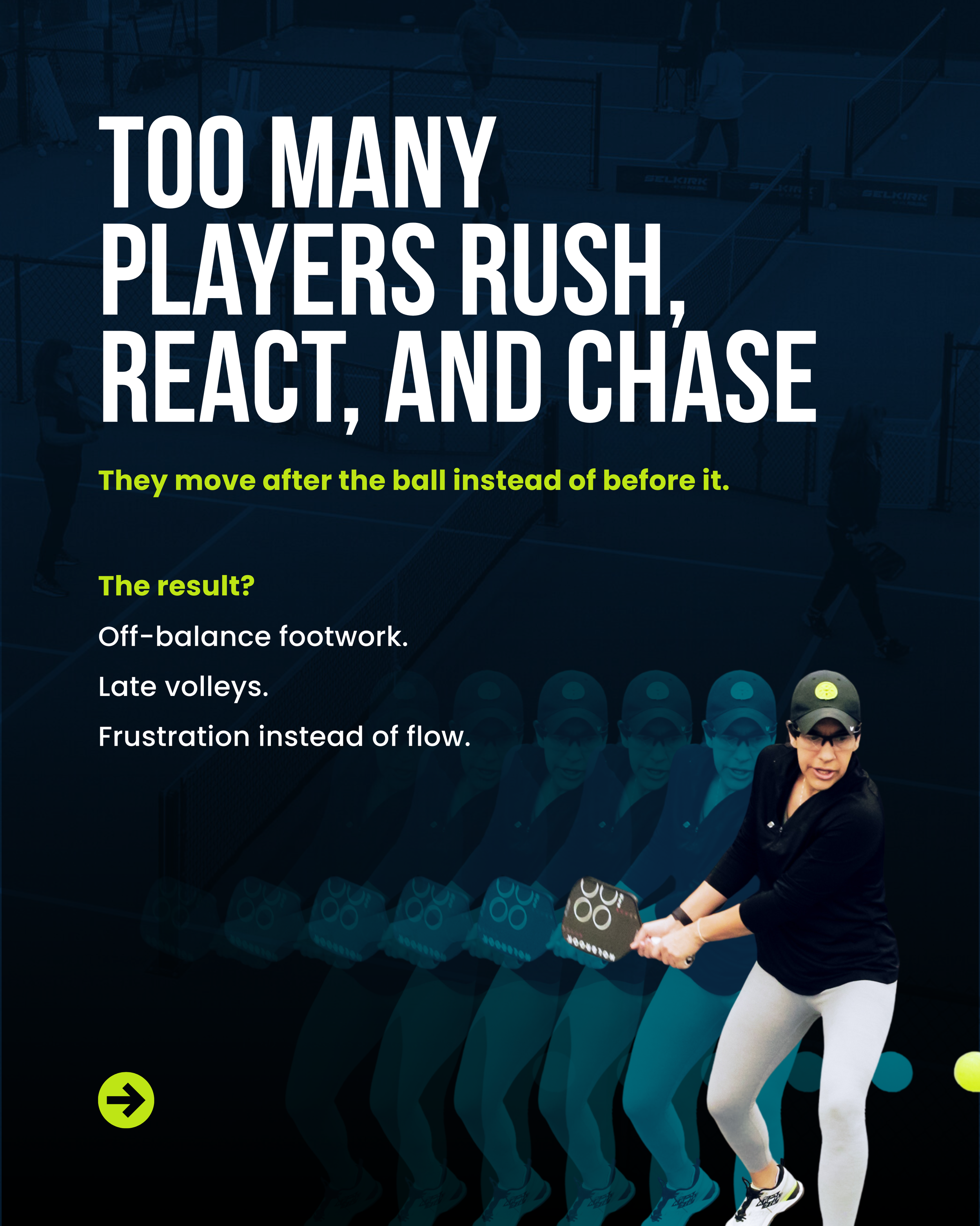
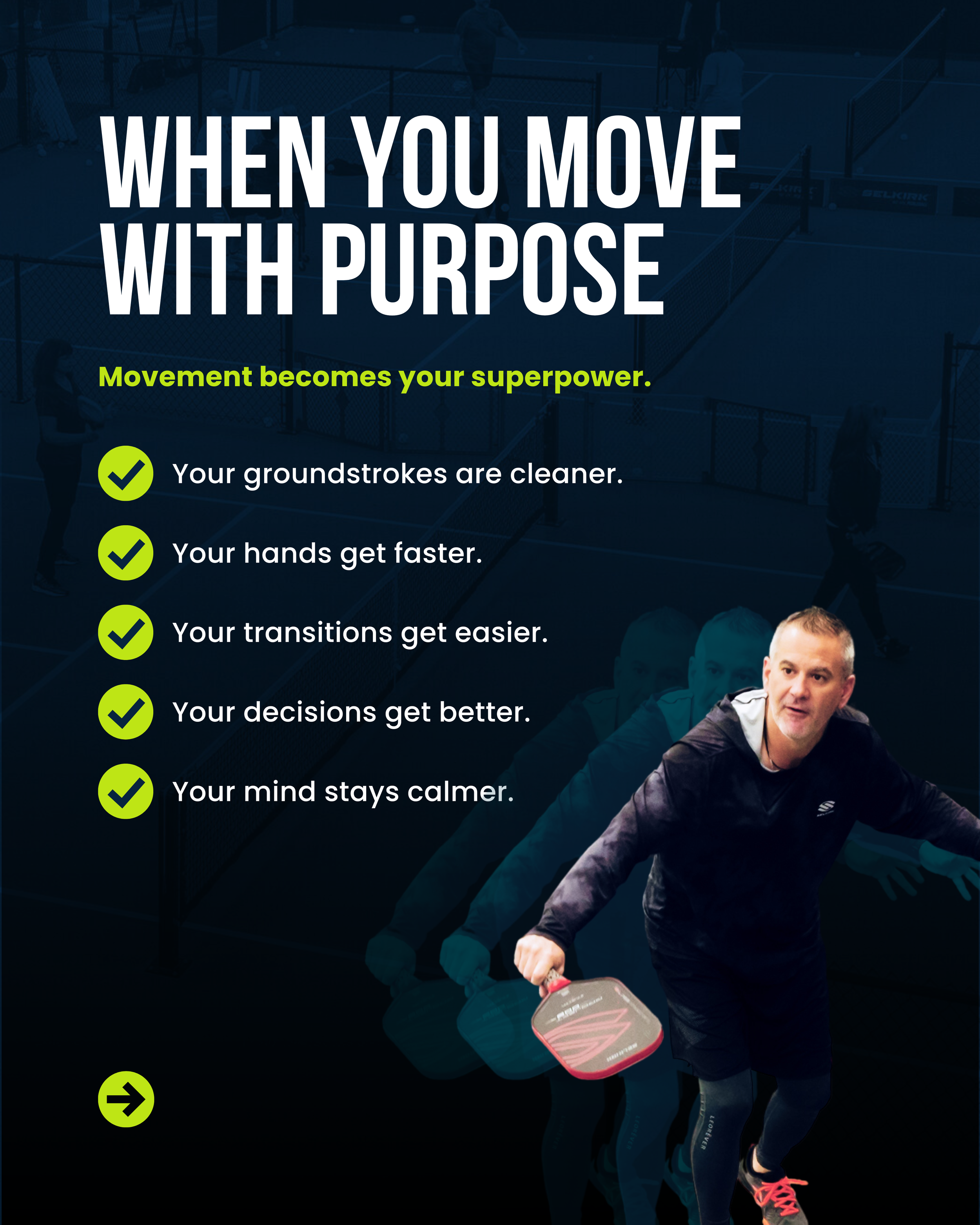
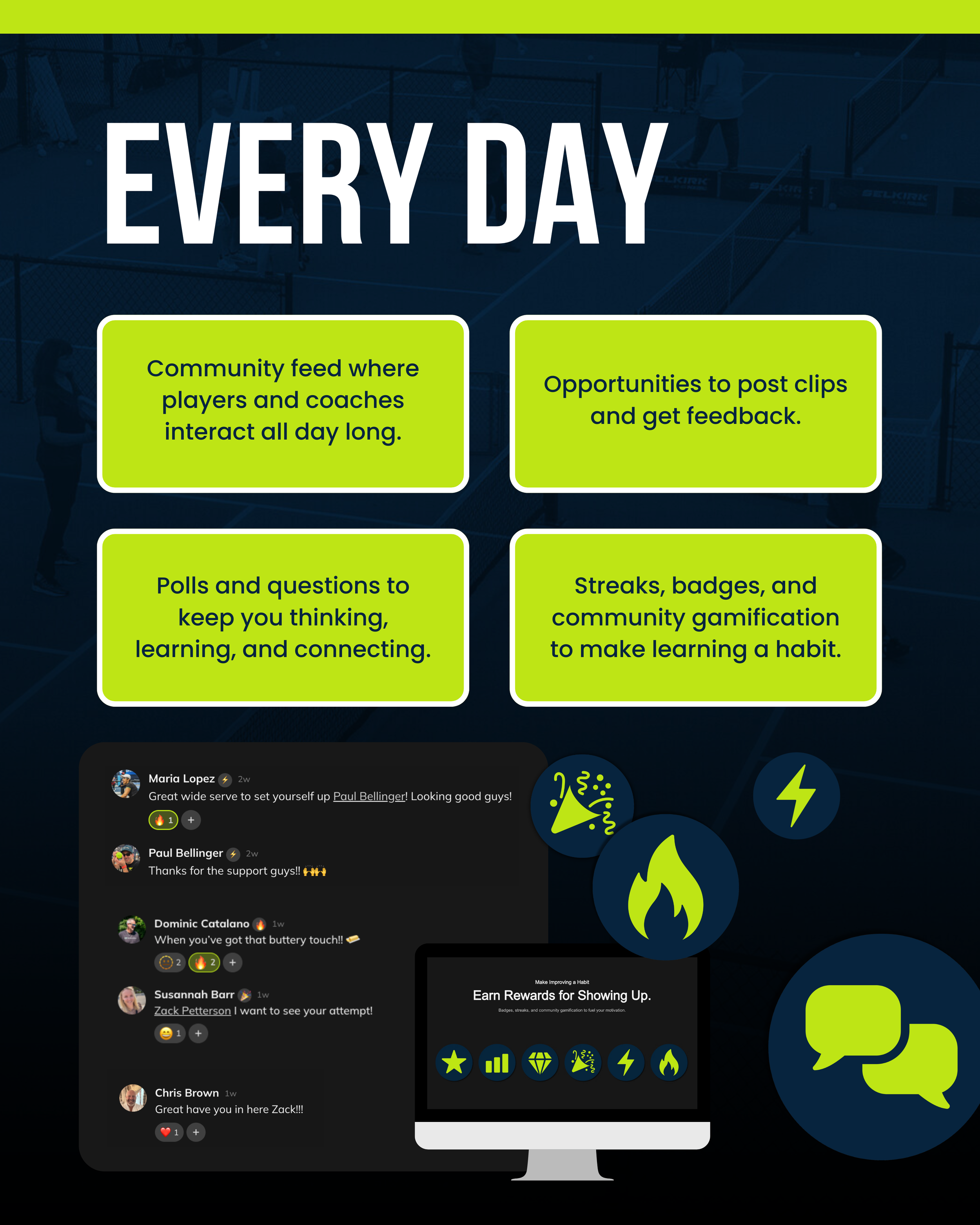
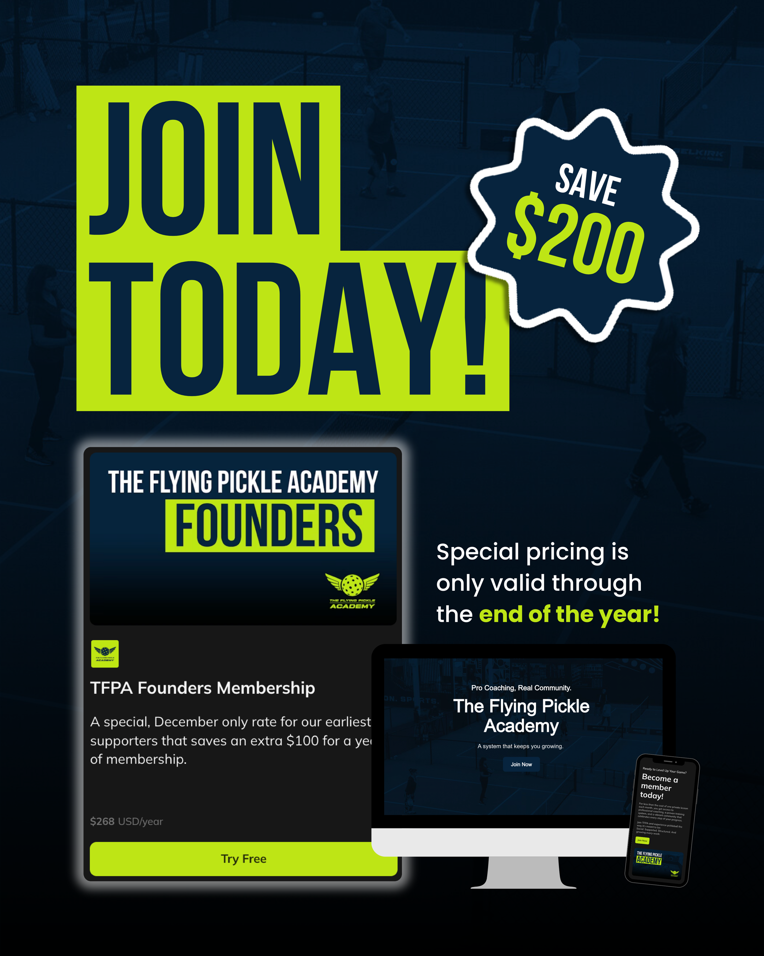
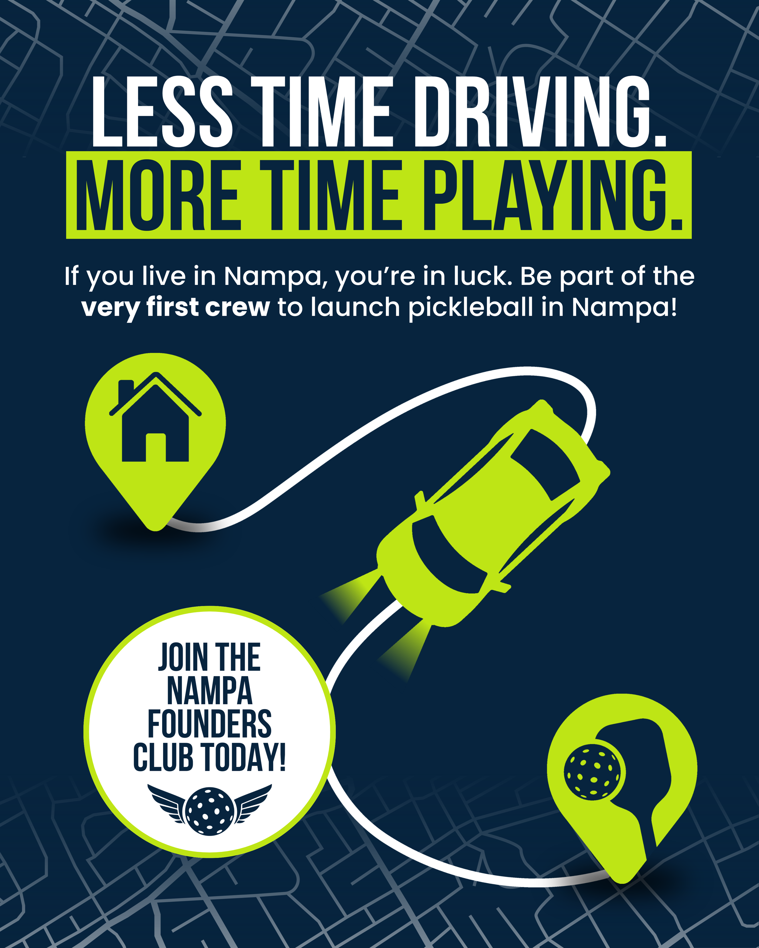
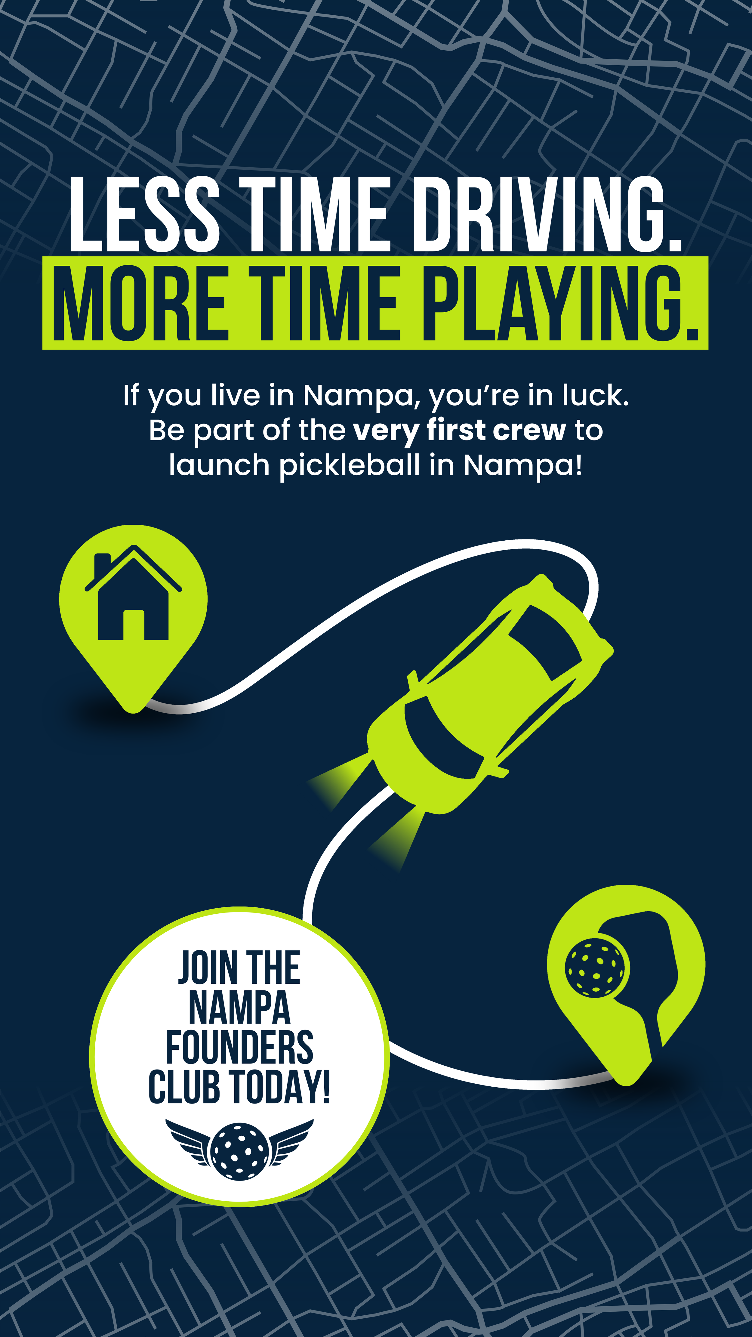
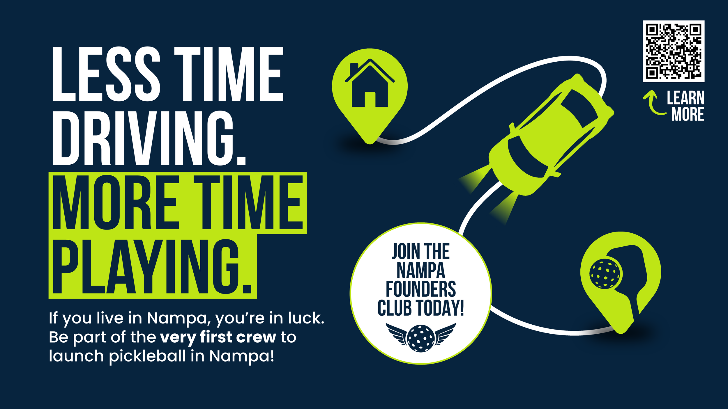
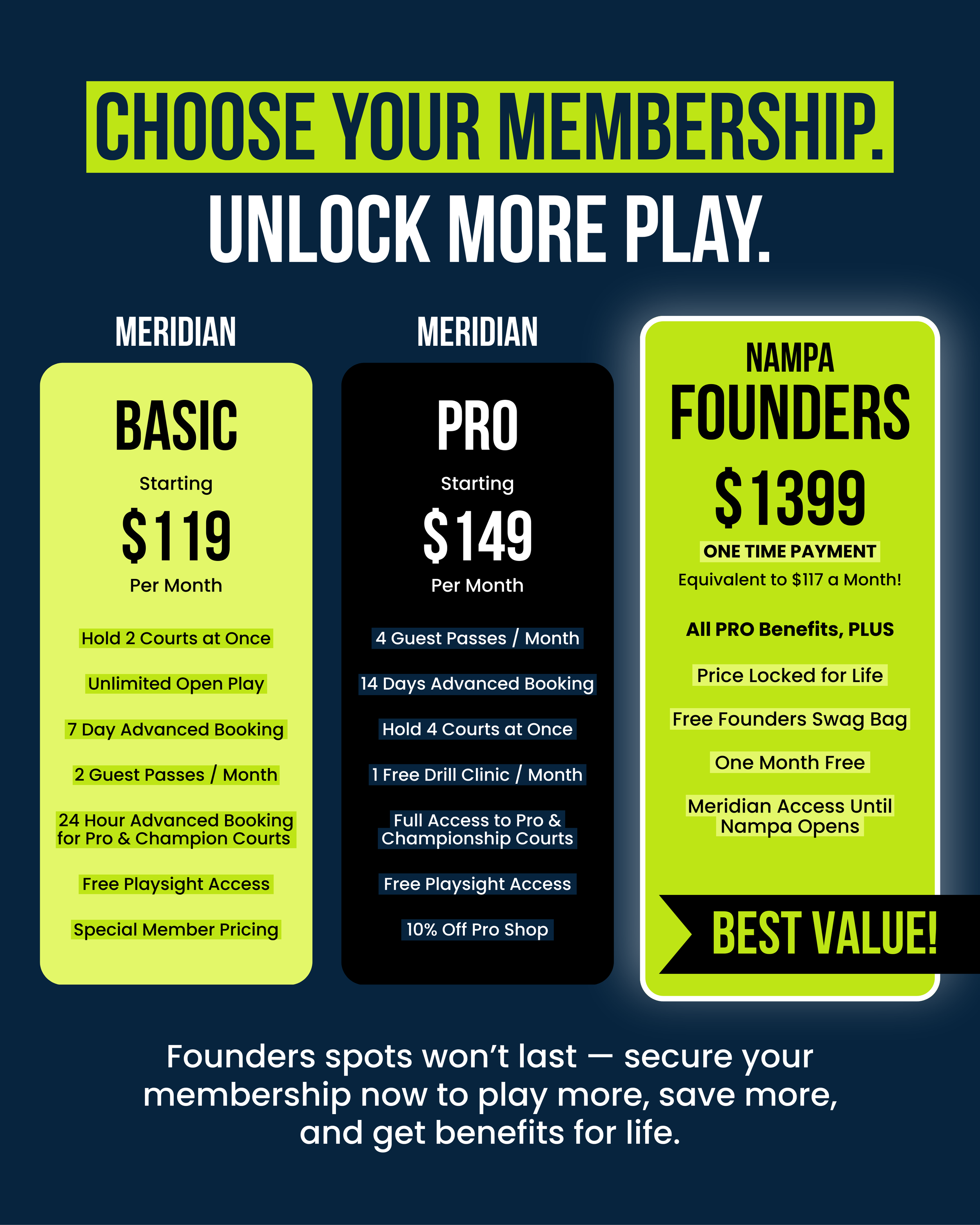
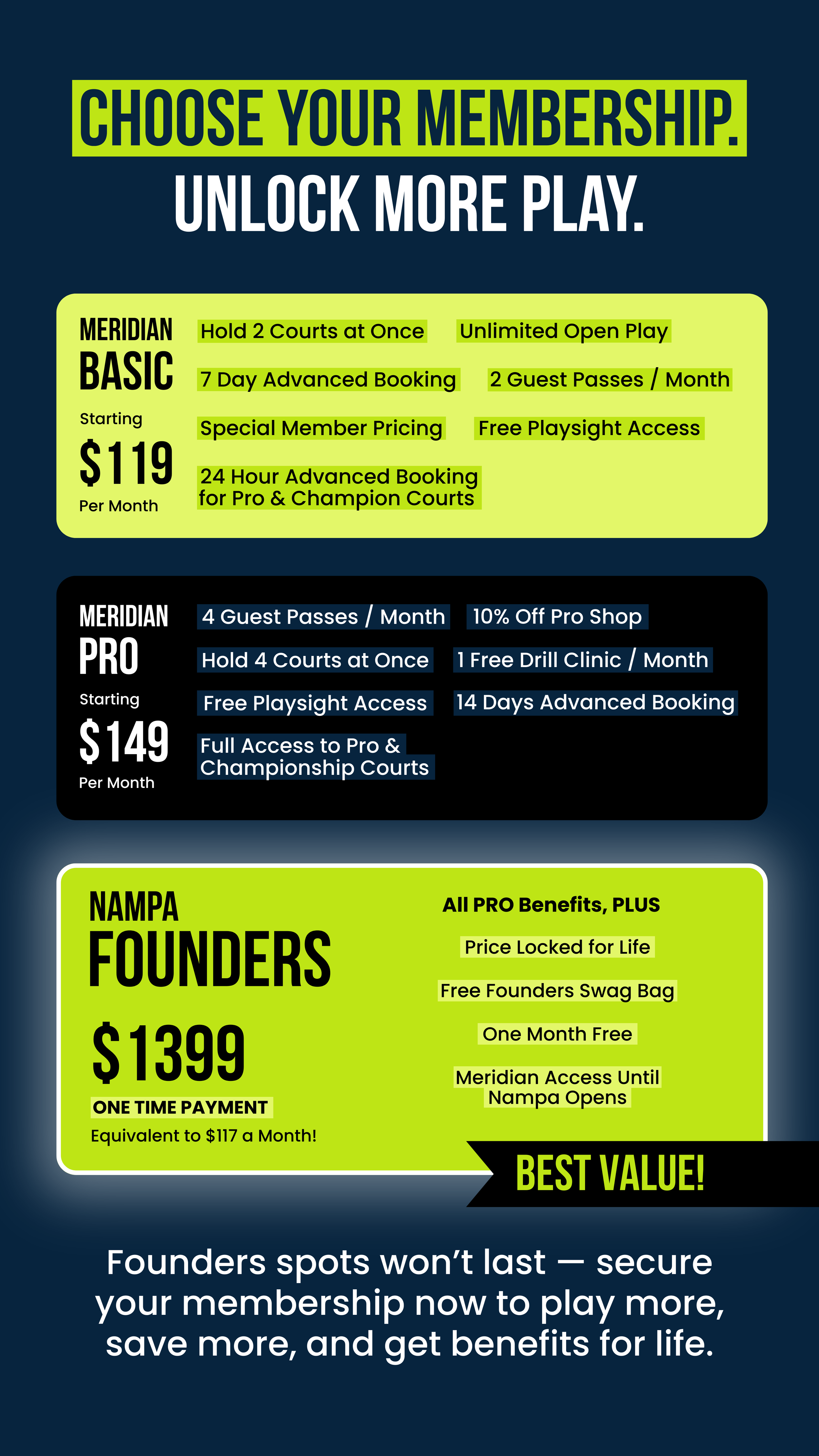
Marketing: Founders Club & TFPA
Club-Level Brand Execution
These graphics support TFP’s membership programs, training academy, and revenue-driving initiatives. The goal is to balance strong branding with clear, effective calls-to-action that drive sign-ups and engagement.
The Flying Pickle Academy


Nampa Founder’s Club

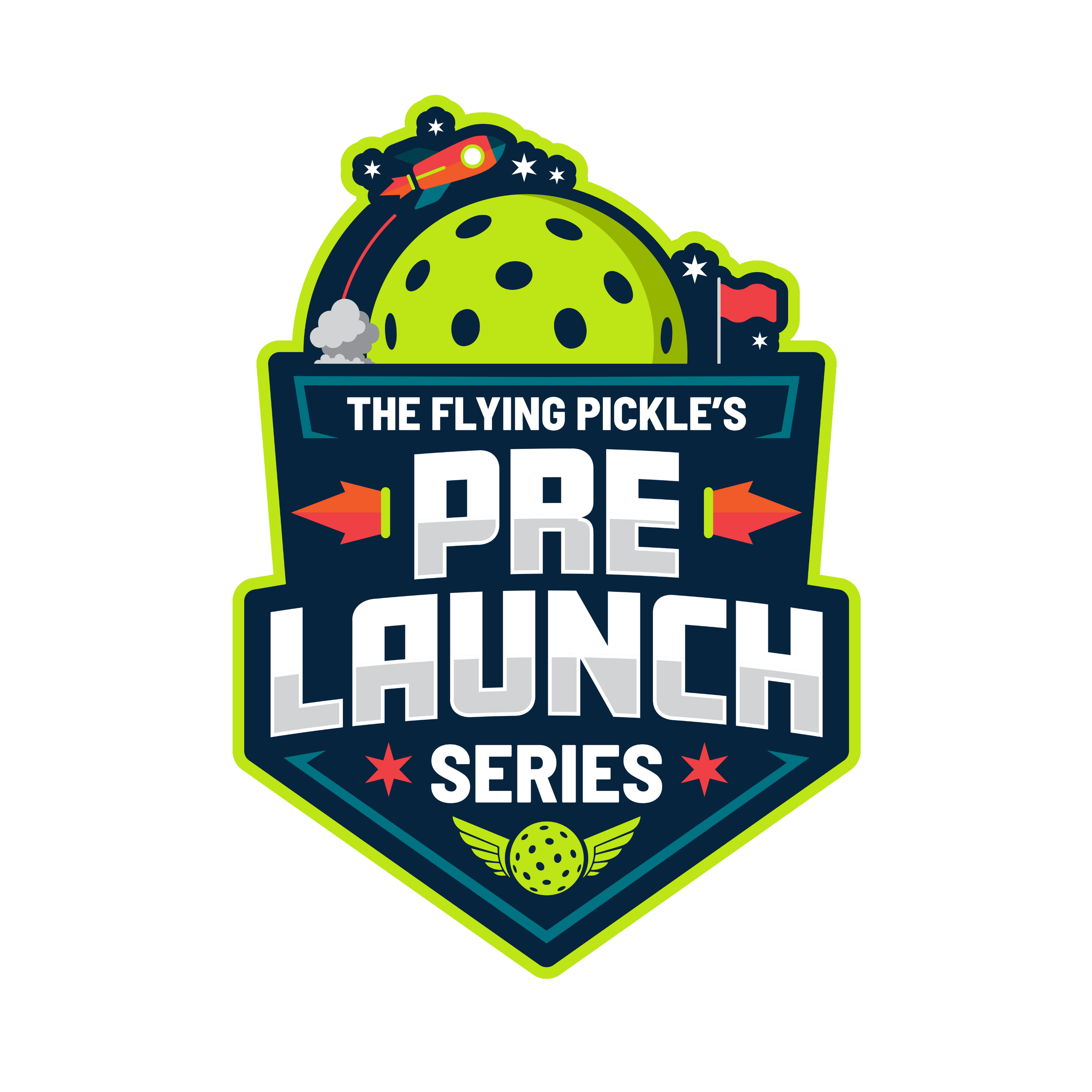
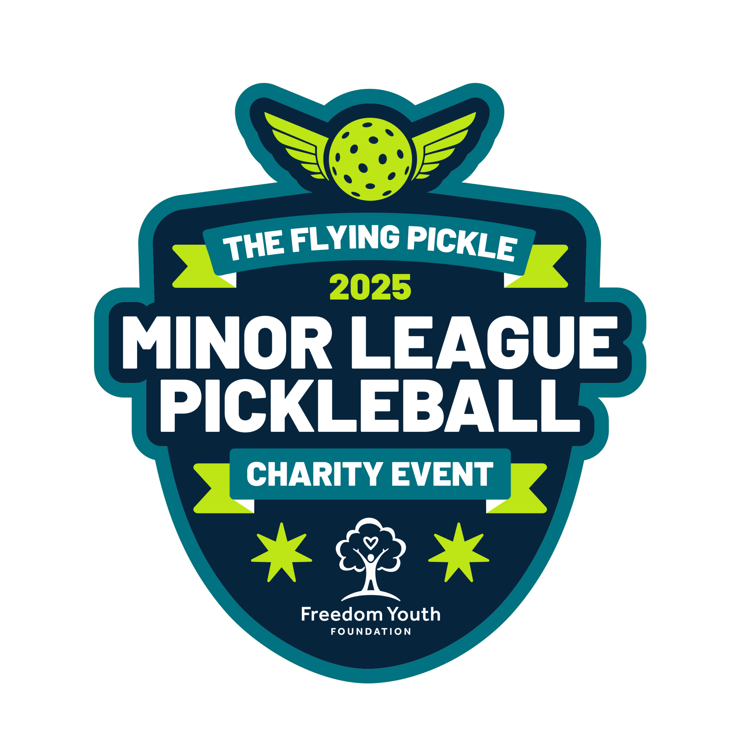
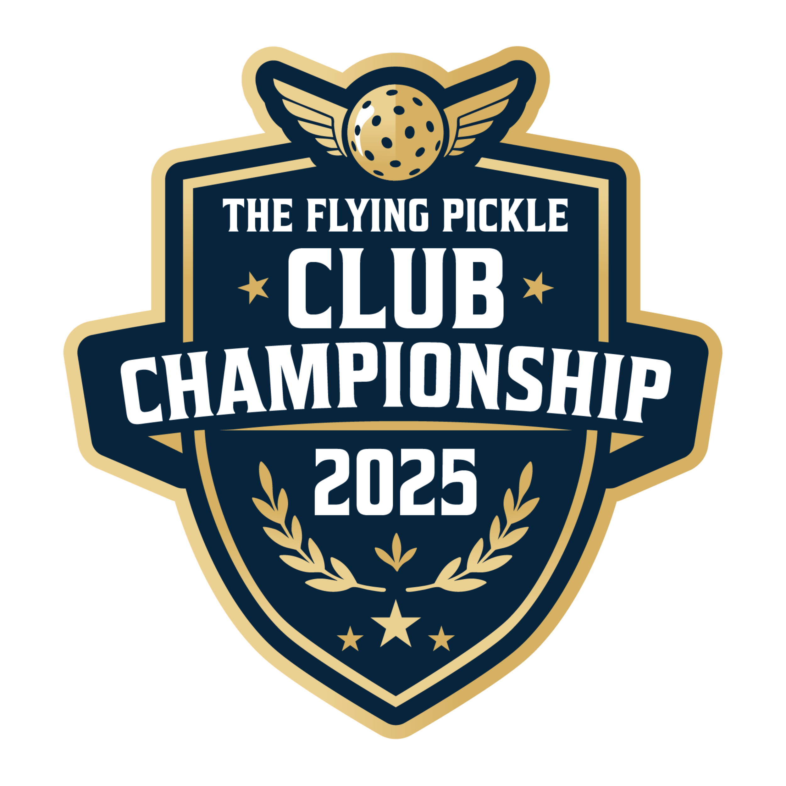
Event Logos
Scalable Event Identity System
Every tournament, ladder, and special event gets its own logo — all built from the same brand foundation. This allows TFP to run dozens of events without diluting the core identity.
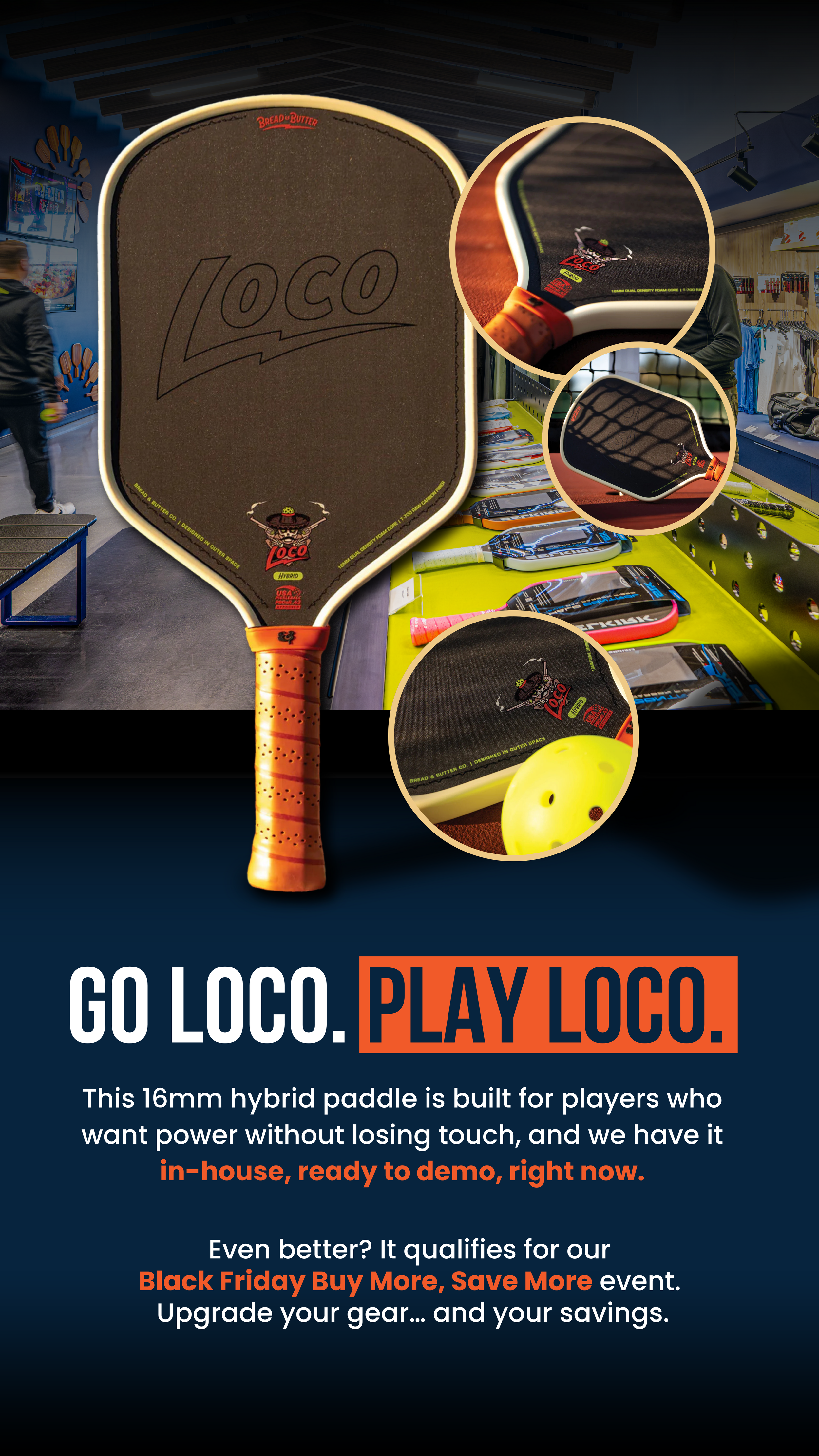
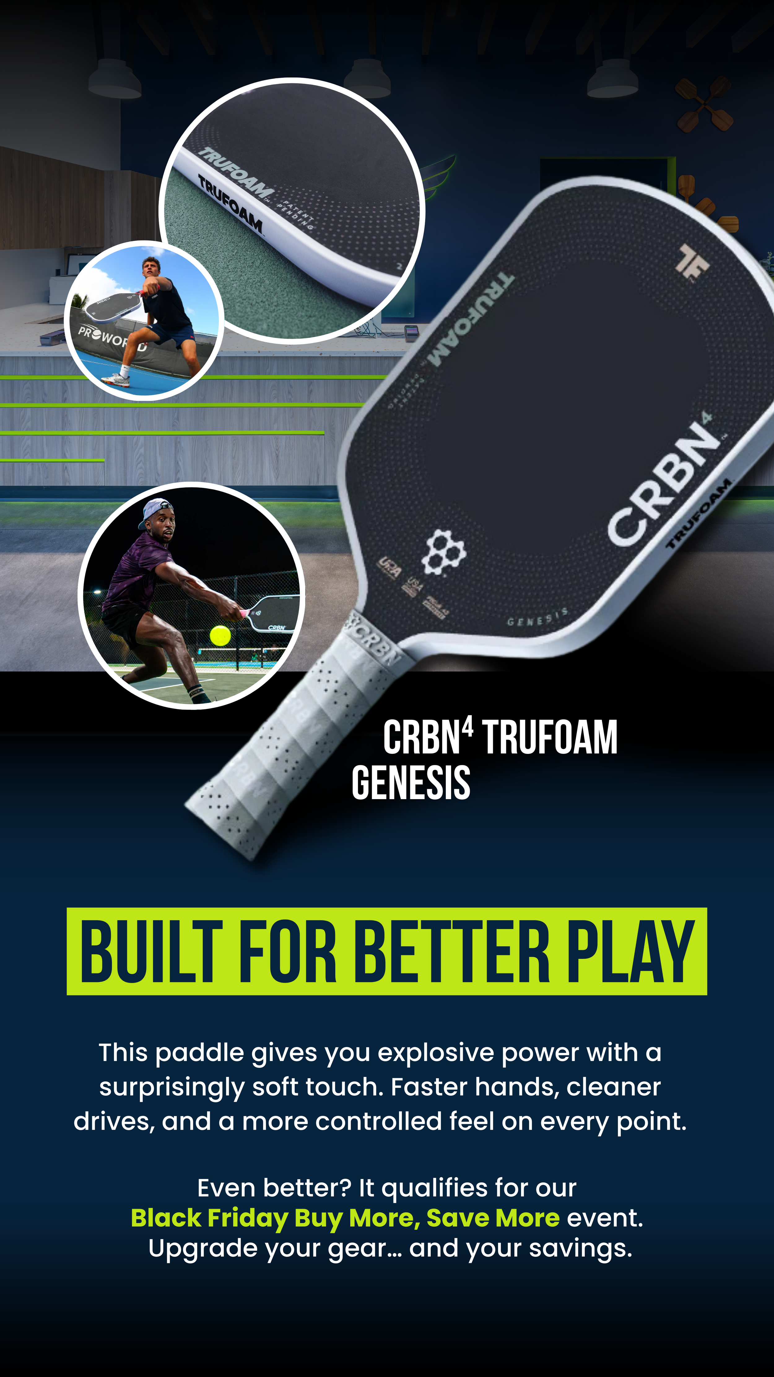
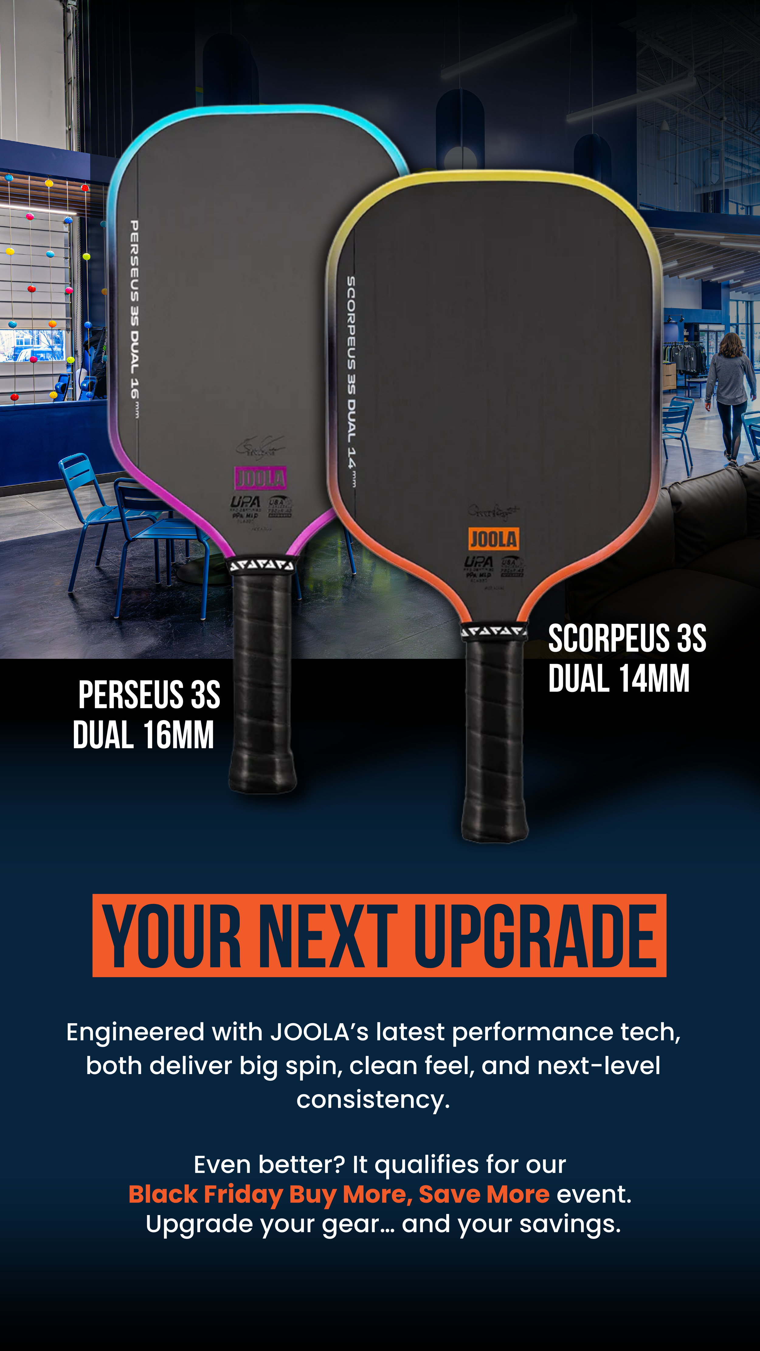
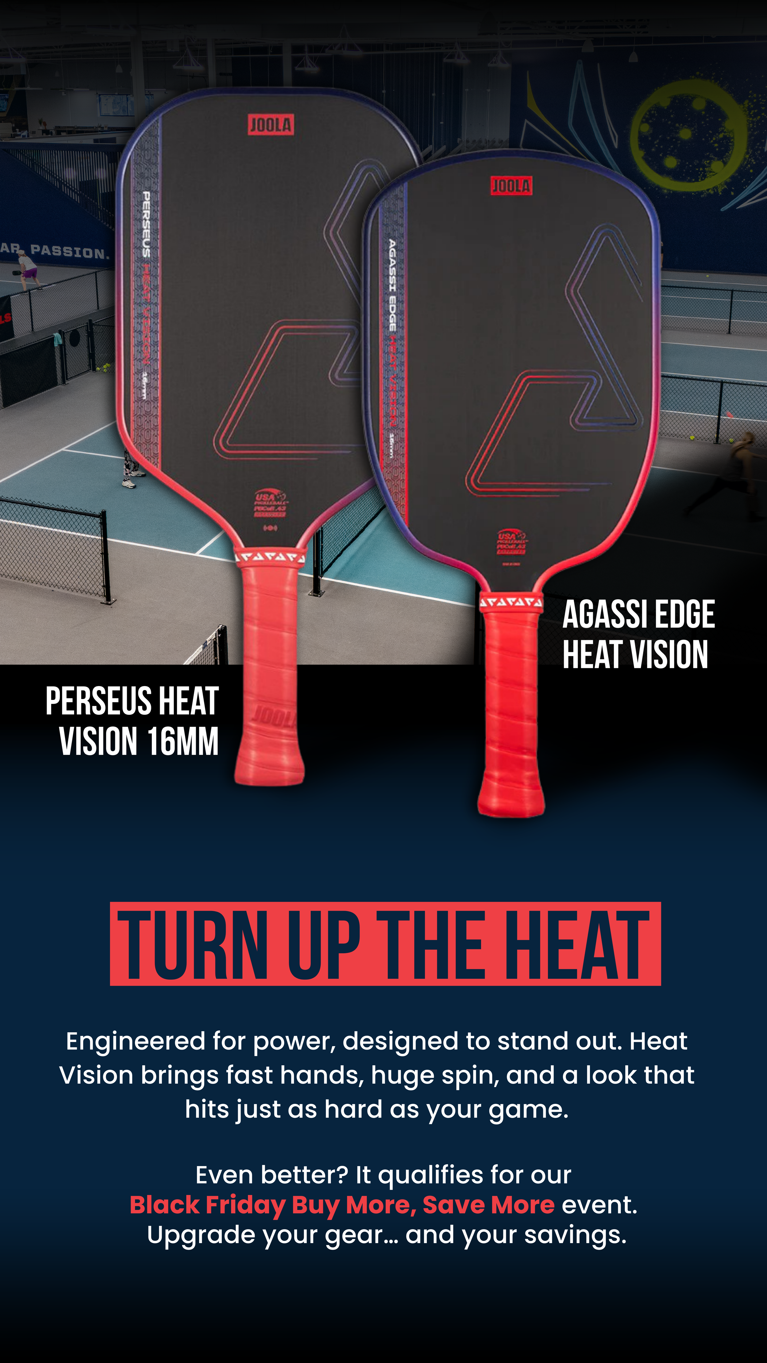
Product Highlight Stories
Retail & Product Storytelling
These posts showcase paddles, accessories, and in-club products using the same visual language as TFP’s social and marketing content, creating a seamless brand experience from feed to checkout.
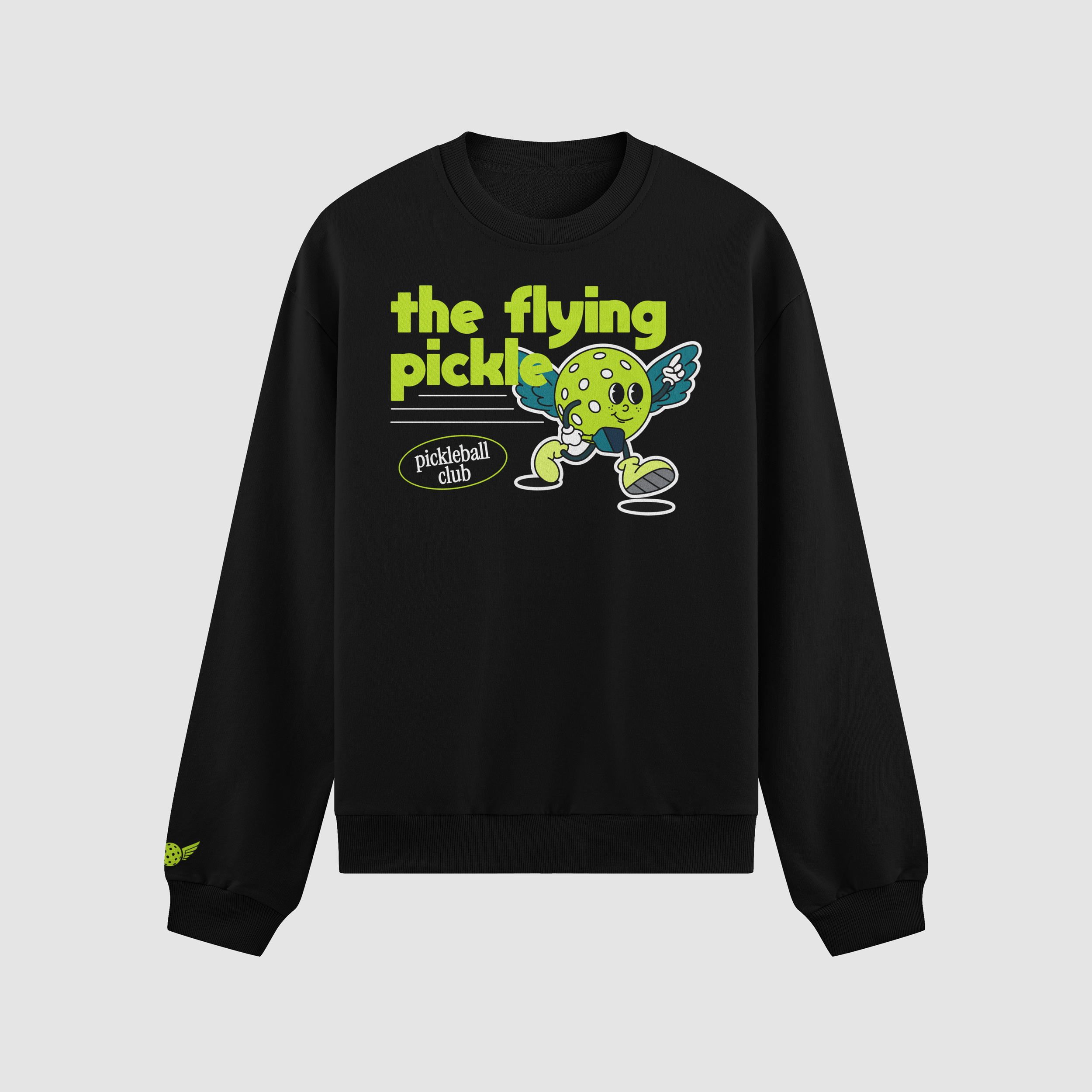
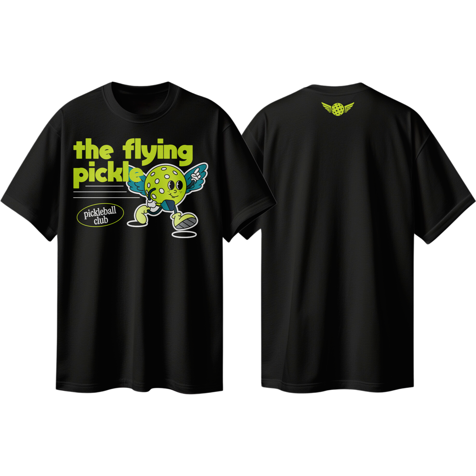
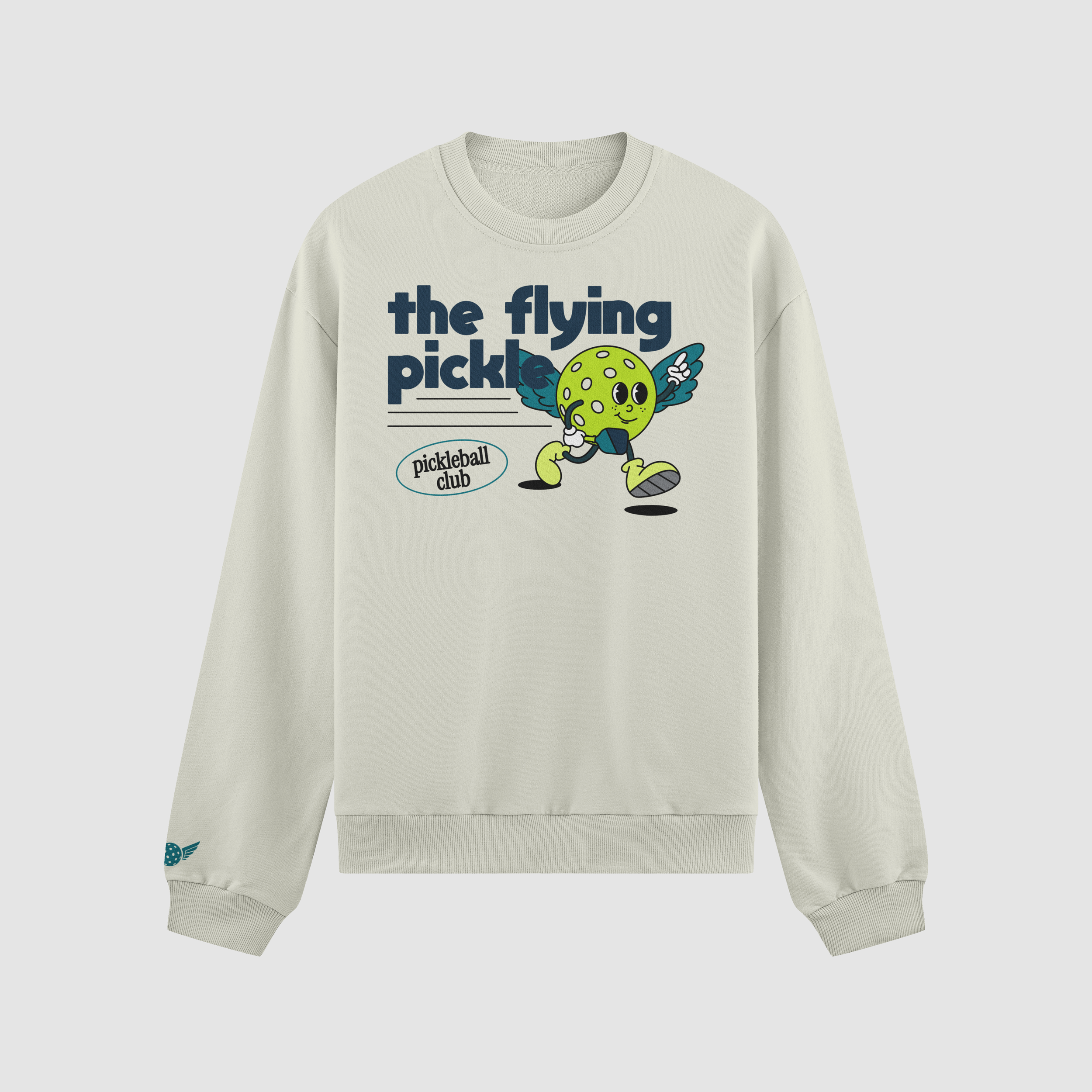
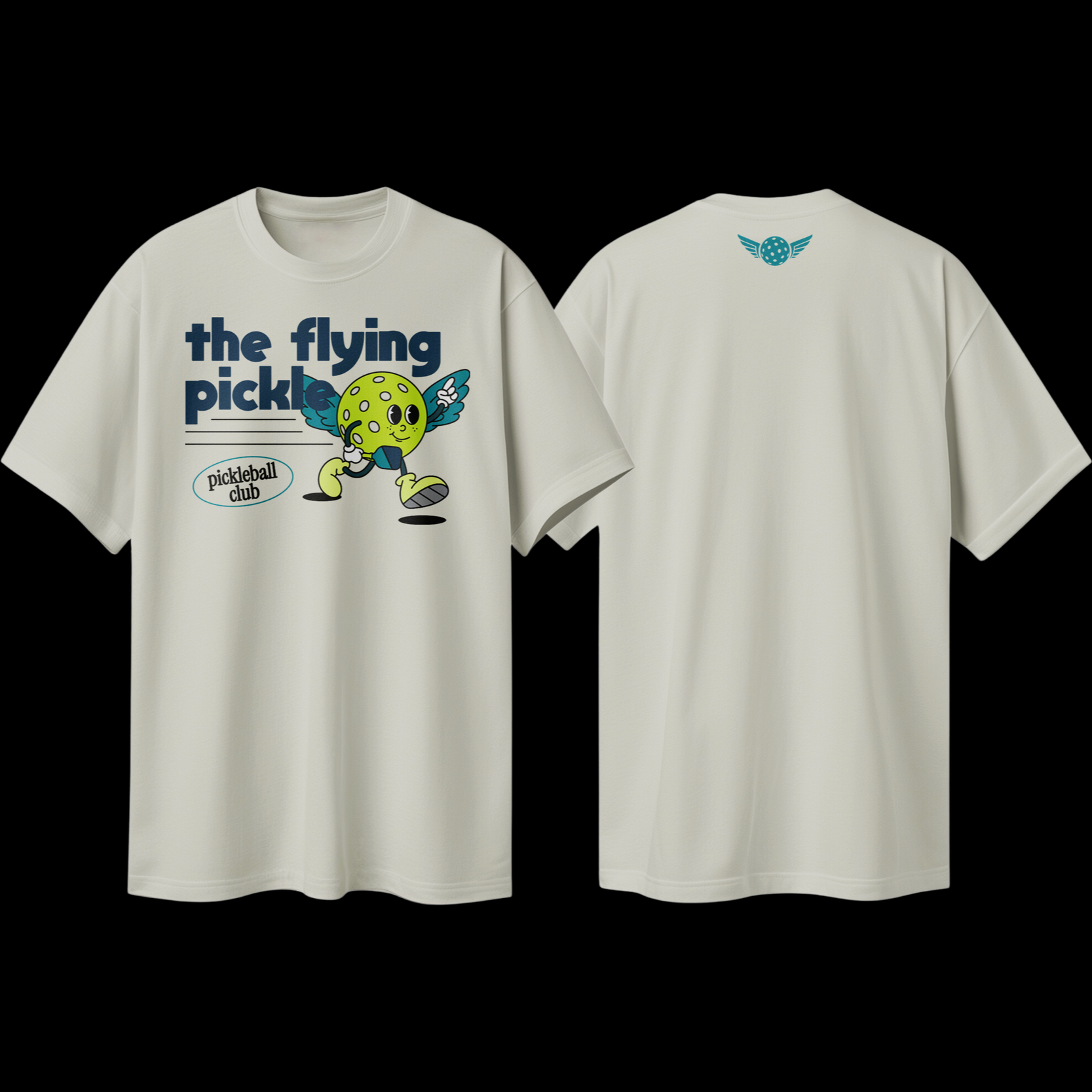
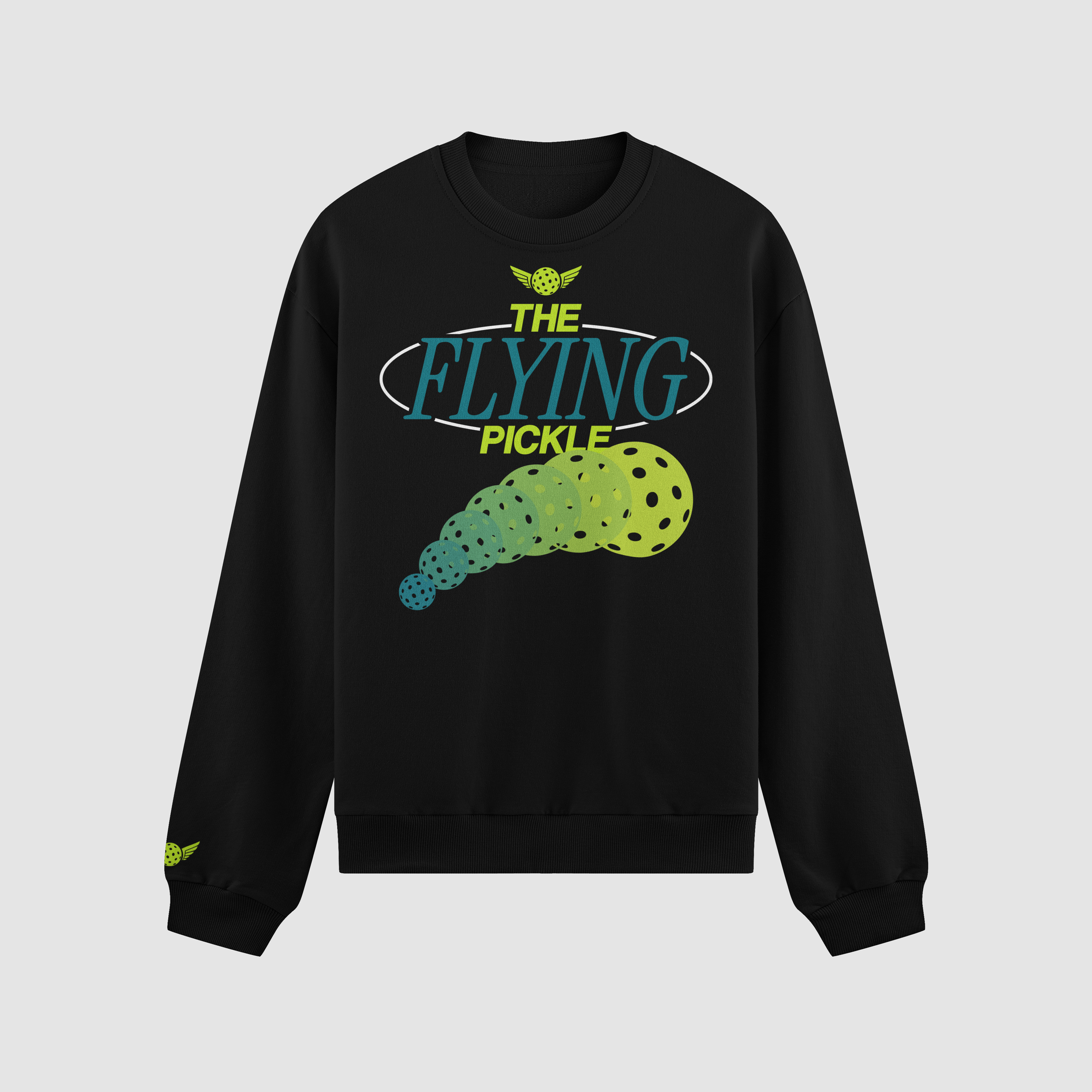
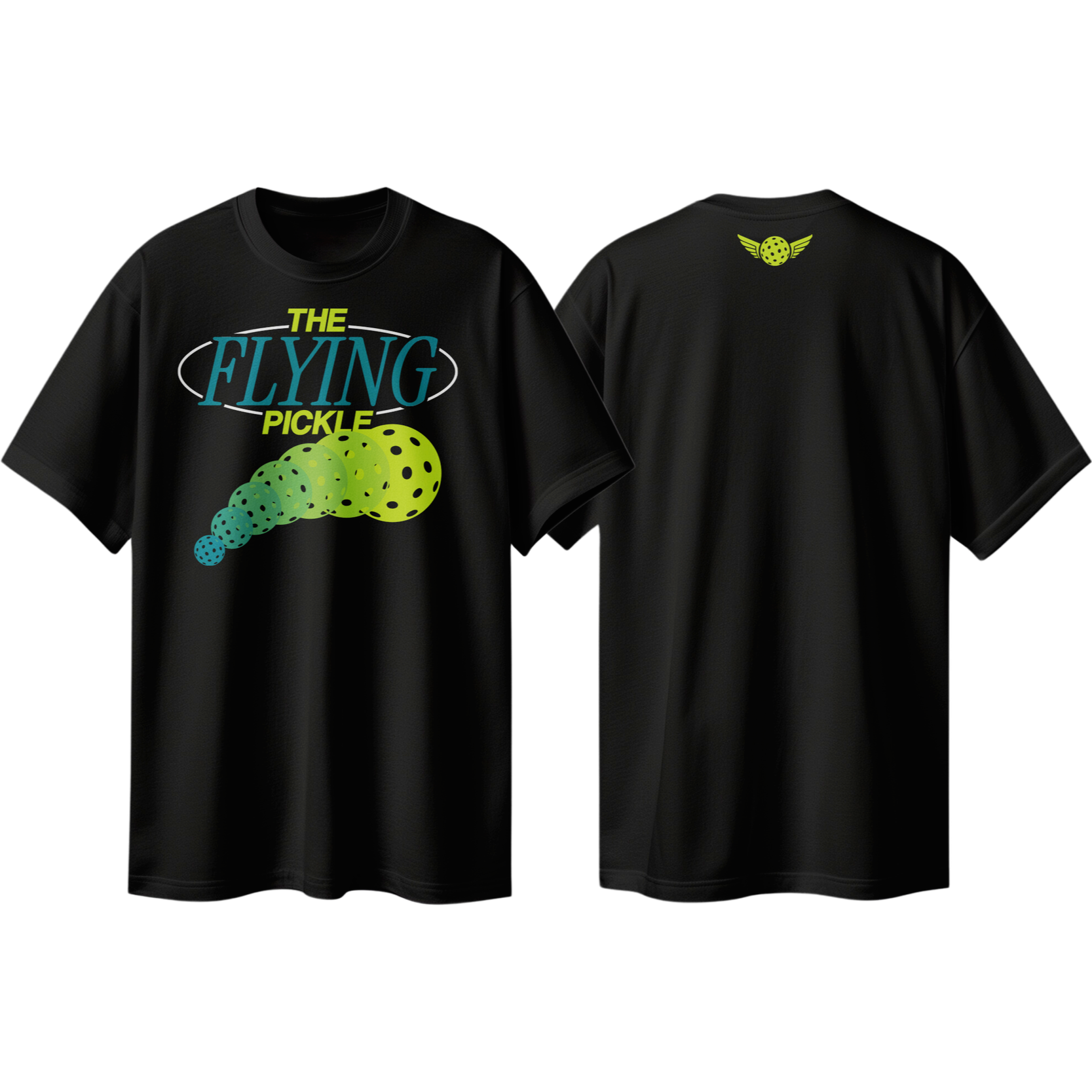
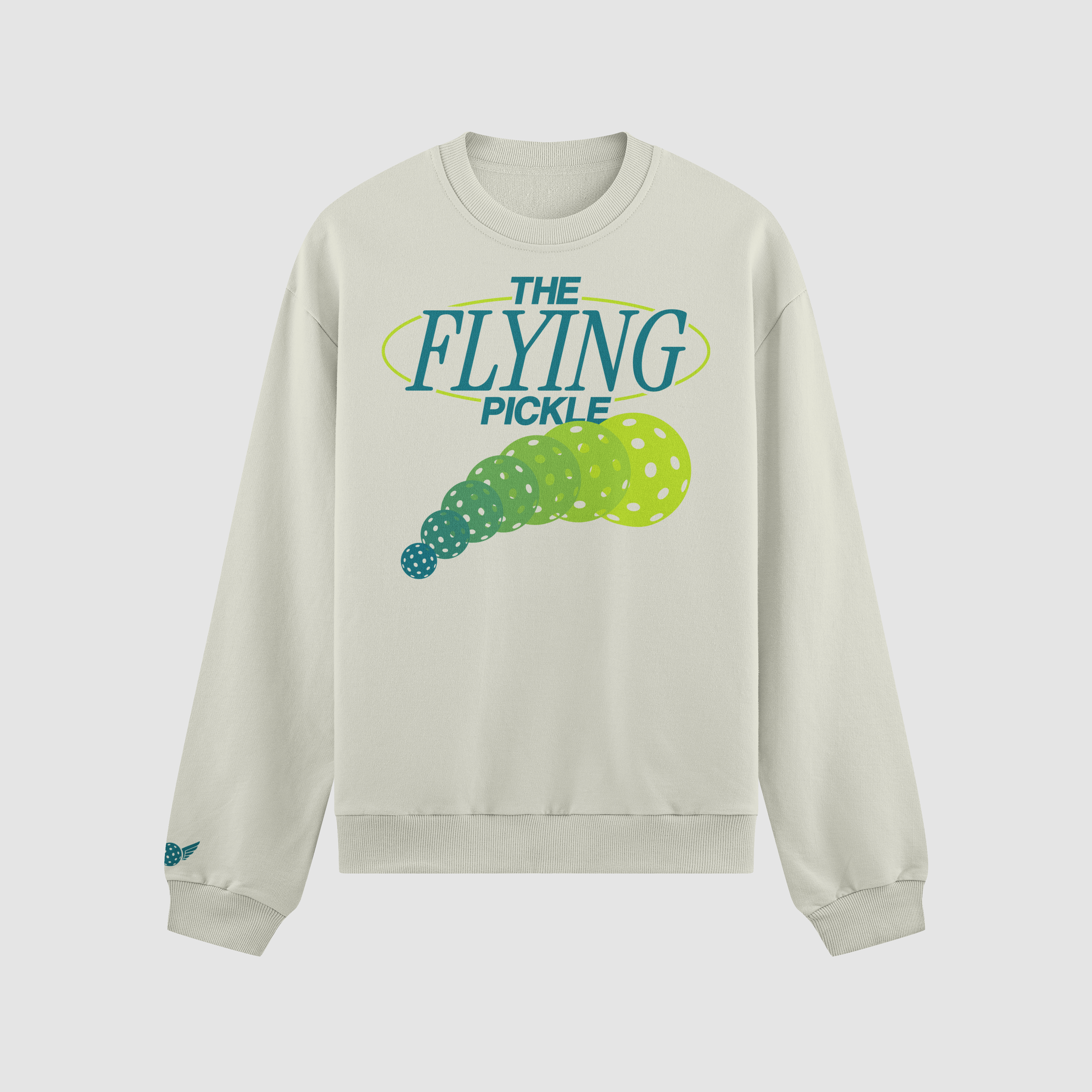
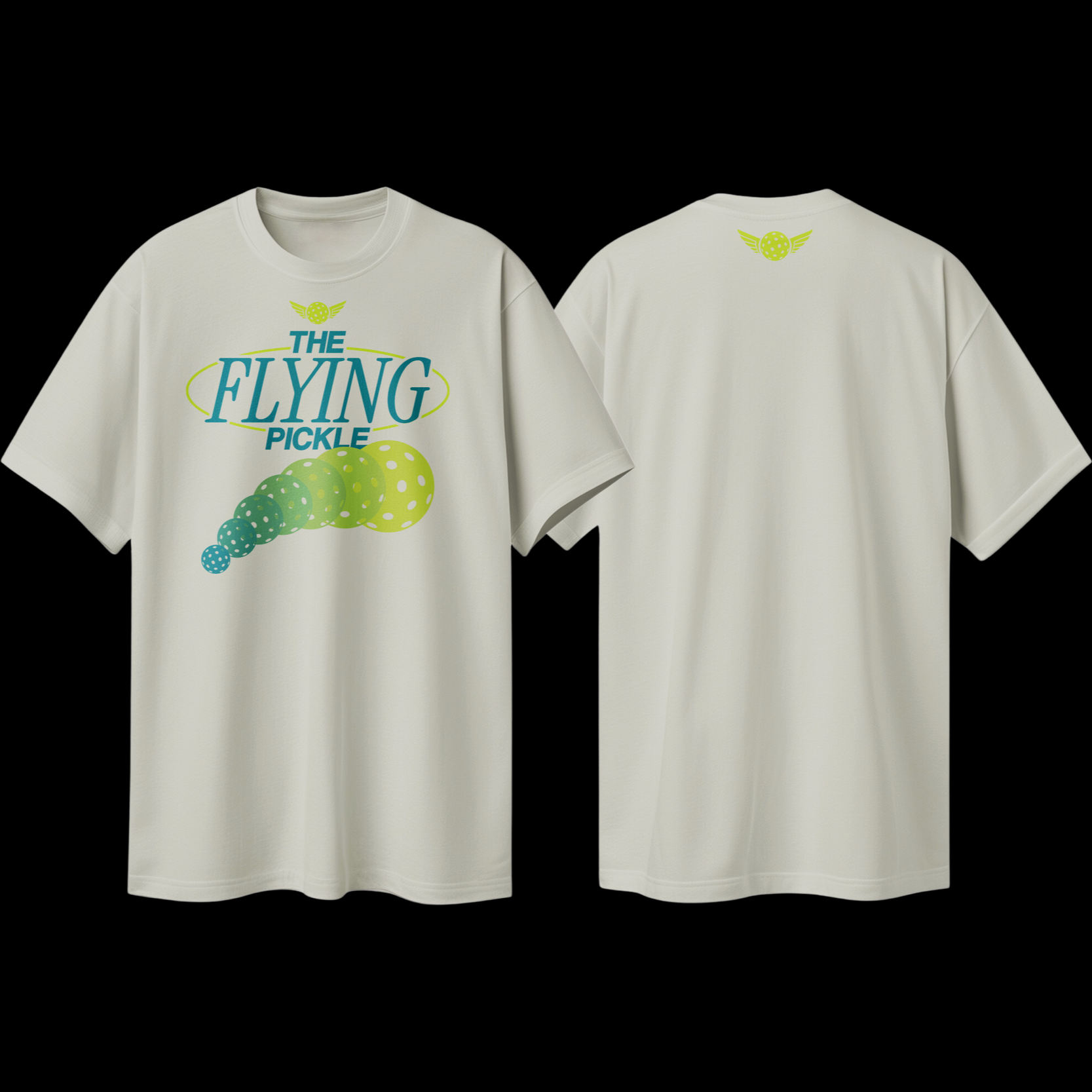
Apparel
Brand Identity You Can Wear
TFP’s apparel extends the brand beyond digital into physical, fan-facing products. The designs follow the same color, typography, and graphic standards used across the rest of the brand, ensuring a consistent look from social media to in-club retail. Select pieces feature TFP’s mascots to add personality and recognizability without breaking the overall visual system.